
Deploy Tech Ltd.
Portable Concrete Water Tanks

The system.
Deploy Tech makes the world’s first portable concrete water tanks — a manufacturing breakthrough born from an Imperial College London project, patented across Europe, the US and India, and trusted by partners ranging from UK farms to UNICEF. Their products land flat on a standard pallet, deploy in two hours, and set within twenty-four. The brief was to take an identity in startup mode and rebuild it as infrastructure — a system that could speak to four distinct audiences without splintering across any of them: engineers, procurement officers, NGO field workers, and farmers.

One product. Four distinct audiences.
The brand has to bridge them.
A leaflet handed to a UK farmer needs to be readable at arm’s length, in mud, alongside spec data. A brochure for a procurement officer needs to look credible against fifteen other supplier documents. A pitch deck for UNICEF needs to communicate scale and impact in three slides. A board pack for an investor reads differently again. The same brand has to hold across all of them — without becoming generic, and without splintering.
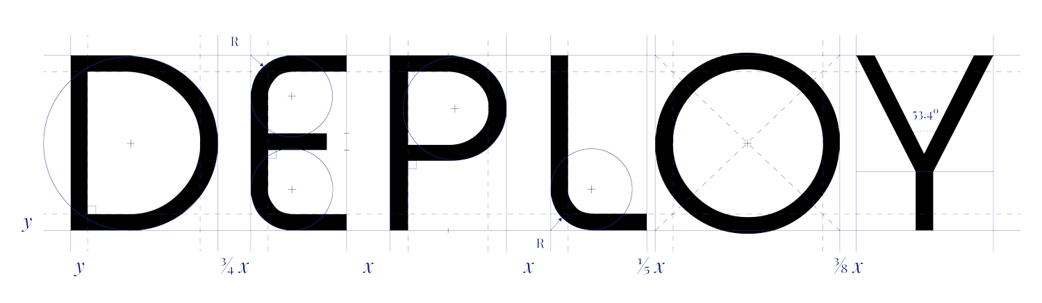
The system that holds it together is built from a small number of fixed elements: one typeface, four colours, one wordmark, one pattern. These form the brand’s spine. Around the spine the rules flex — illustration registers, data treatments, instructional layouts, image styles — depending on which audience the document is for. The fixed elements never change. The flexibility is in how they’re applied.


Brand values
Five pillars hold the brand.
-
Adaptable
Technology that bends to context, services that adapt to the audience. The brand reads as engineering credibility for procurement, a clear field tool for installers, and humanitarian utility for aid agencies — without changing its core.
-
Approachable
Communicative in every register and present at every touchpoint. The system speaks in plain language whether the surface is a procurement deck, a postcard, or a panel on the side of a tank. Never industry jargon, never corporate cool.
-
Bridge
Concrete is the oldest infrastructure material humans use. Deploy folds it. The brand connects old to new, customer to technology — translating a manufacturing breakthrough into something a farmer or a field worker can recognise at a glance.
-
Facilitate
Every Deploy document is a problem solver. The system surfaces solutions over features, opportunities over capabilities. What the product enables, not just what the product is.
-
Quality
Quality is not implied — it’s documented. The system specifies how every element is treated, from logistics workflows to surface application. The standard is consistent because the rules are written down.
In use.
The palette runs on one principle: every colour must name something. No colour is chosen for atmosphere, accent or design flavour. Foundation positions; Sky speaks to the user; Clay names the ground the product lands on; Canvas is the material itself. The brand stops there. Adding a fifth would have meant adding a meaning, and there were only four meanings to name. Black and white do what they always do — they hold ink and they hold paper. Neither earns a place in the palette.
Avenir holds the entire system on its own. Light spaced as the wordmark, Roman for spec data, Bold for emphasis. The decision to run on a single typeface is a system decision, not a stylistic one — it removes a variable. Whether a Deploy Tech document is a printed leaflet, a procurement brochure, or a deck slide, the type rules don’t change. What shifts is which weight is doing the work.
Typography
Avenir
One typeface across the entire system. Five weights are specified in the brand guideline — Book, Roman, Medium, Black, with Book Oblique for technical specifications — each carrying a defined role. Below, three of those weights set the same brand-defining phrase.
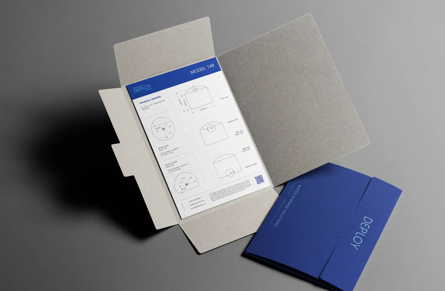


The system extends past the static elements. The guidelines specify two illustration registers — flat icons for moderation, isometric icons for technical depth, both with light and dark variants. They specify a data treatment for moments where the brand has to make impact legible: comparative numbers angled at 0°, 45° and 90°, structured 'them vs us' so a difference reads at a glance.
They specify how a process — Level, Lay, Irrigate — should be drawn step by step. They specify a repeating geometric pattern, derived from the corrugated concrete canvas, used at moderation across covers and dividers. The brand guideline is, in effect, a manufacturing document for everything Deploy Tech says about itself.
One brand.
Four audiences.
Deployed.
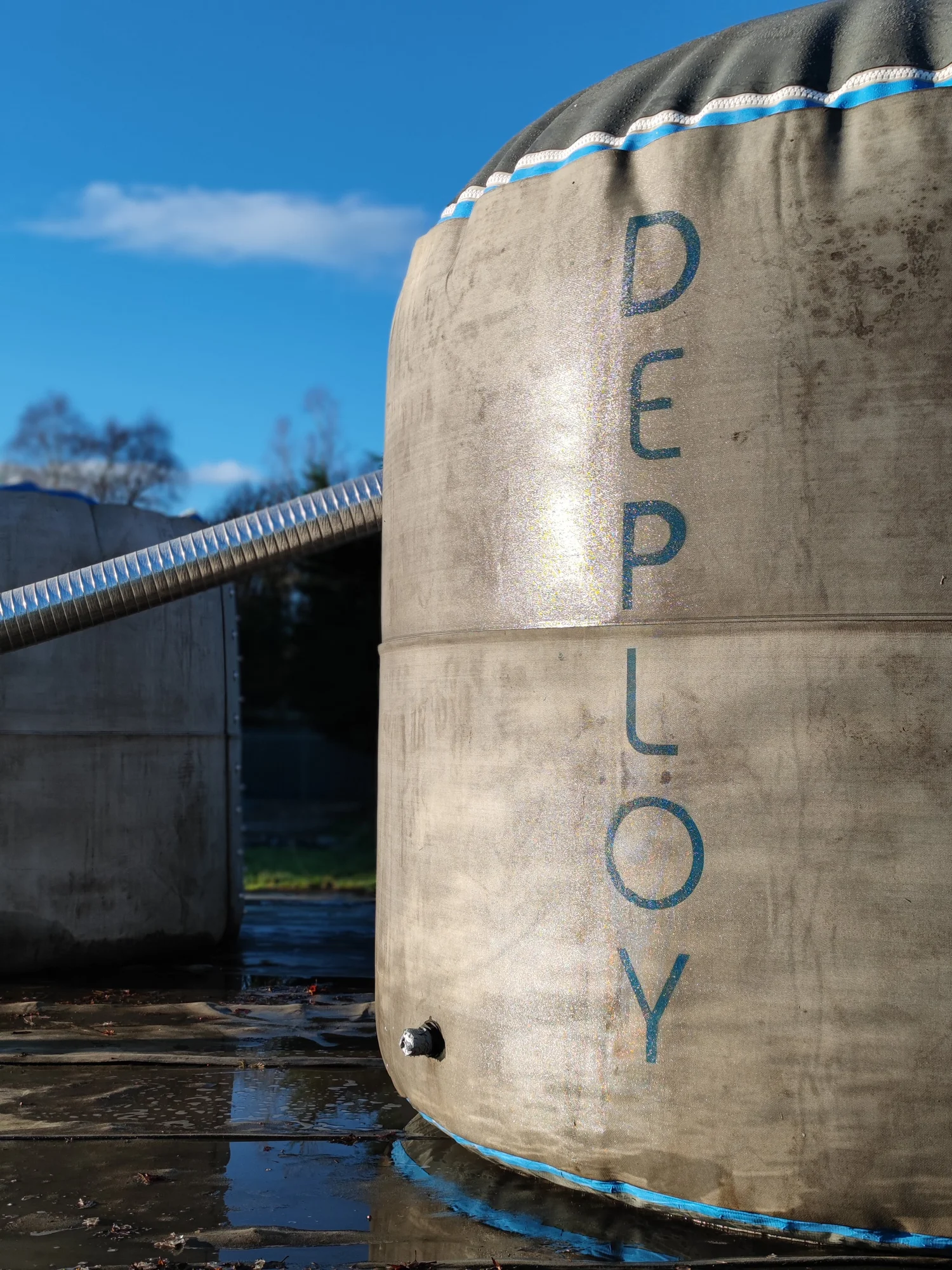 Photograph: Deploy Tech Ltd.