

DFR-0522 · Case study 06 / 06France
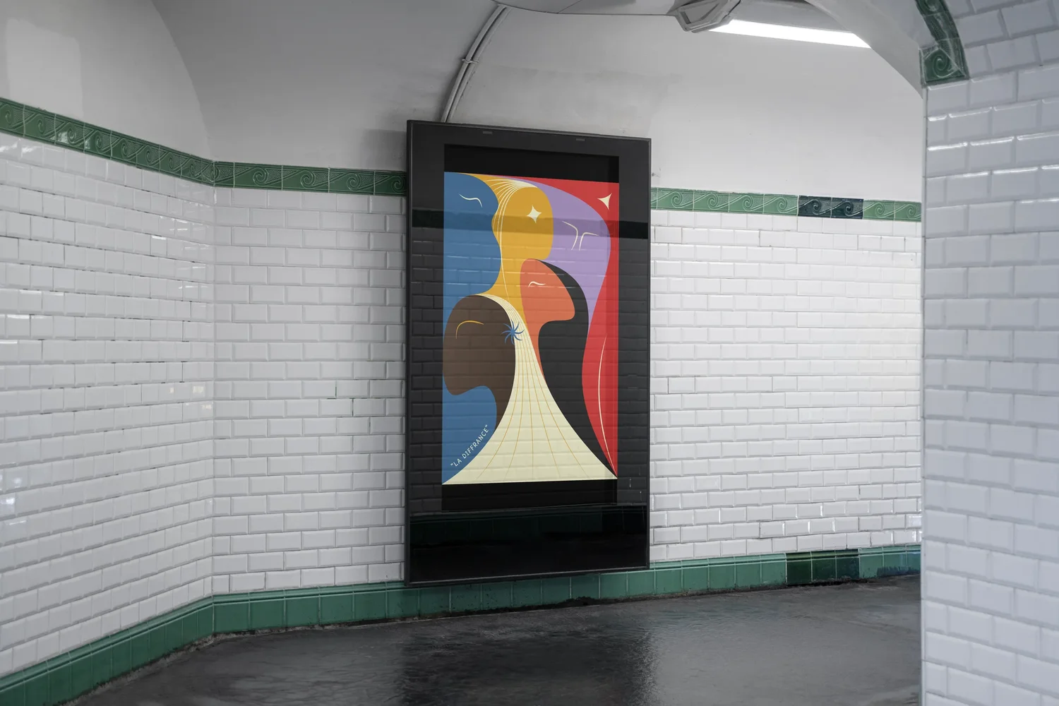
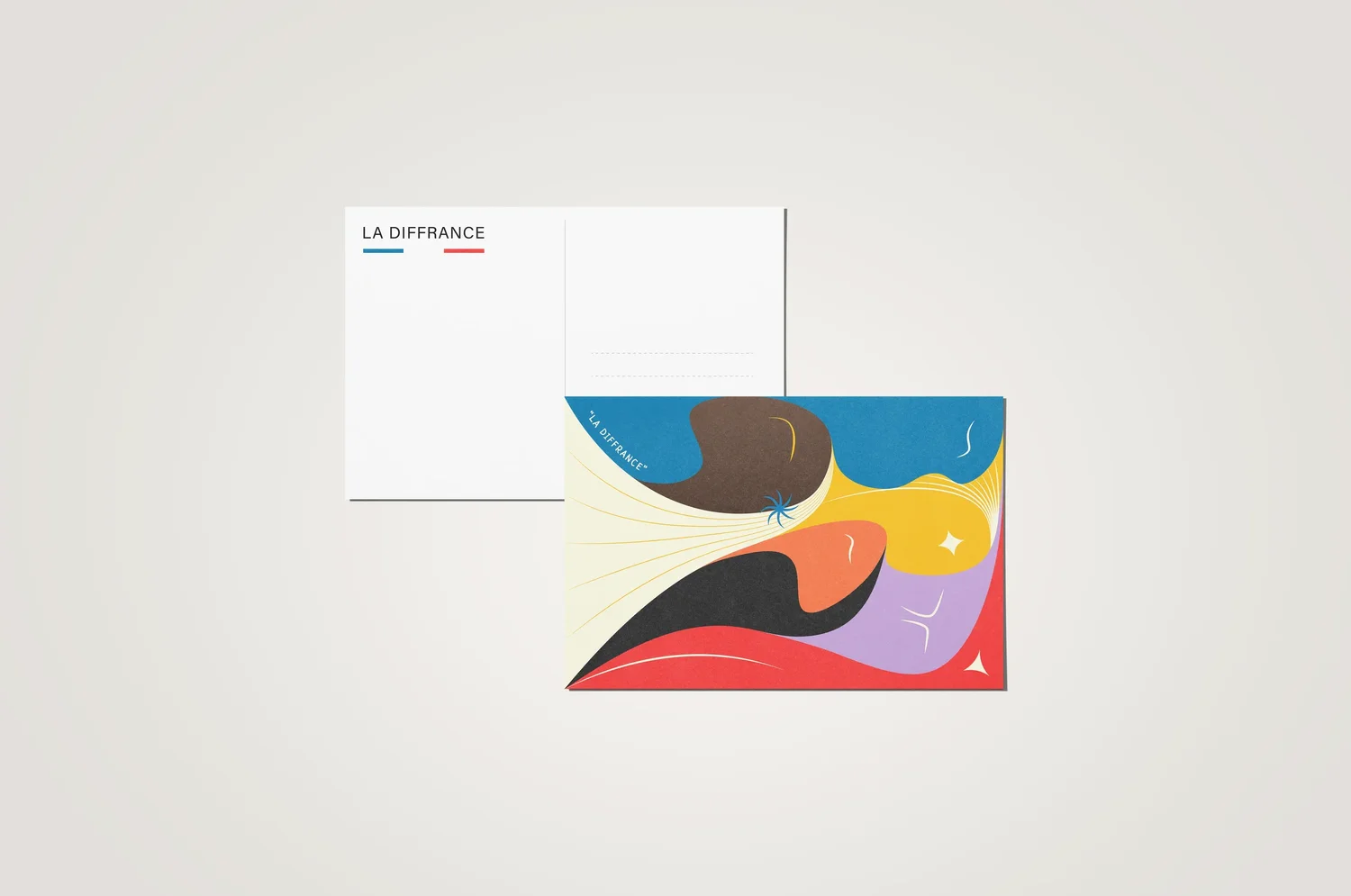
To be different, to live differently, or simply to be indifferent to the political, sexual and morphological differences of others. This poster celebrates the differences that constitute France. “La Diffrance” is a portmanteau that plays phonetically on the fusion of “différence” and “France”. Its aim is to question the polarisation of individual differences so often presented as incompatible, yet which together form a common identity.
- Year
- 2022
- Client
- Clear Channel
- Role
- Creative Direction, Research, Graphic Design
- Type
- Competition entry
- Award
- Le Futur Prix 2022, Finalist
The idea.
Difference is not division. It is the common identity.
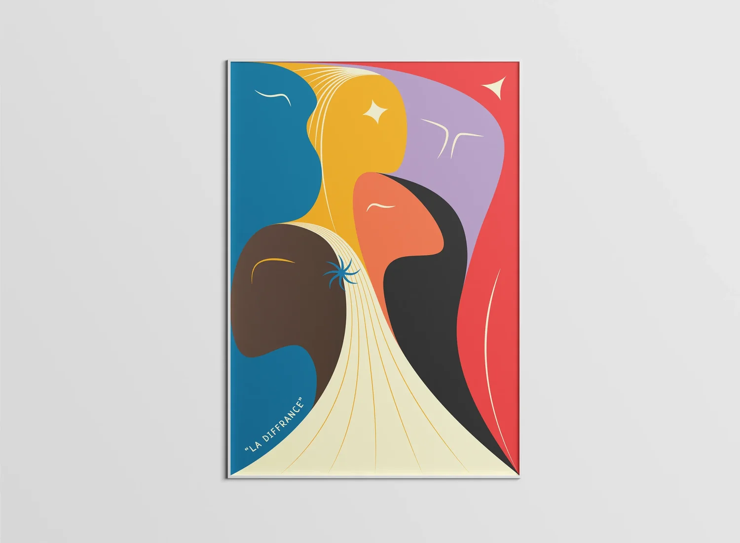
The project begins with a simple observation: France is a country that narrates itself through opposition. Blue against red, metropolis against overseas territory, tradition against modernity. Clear Channel’s brief invited a celebration of French diversity, but a superficial celebration would not do. The challenge was to find a form capable of holding contraries together without resolving them. The answer is a triptych of human figures ordered along the bleu-blanc-rouge, whose reading multiplies at every level of attention.
The three figures represent the political spectrum (conservative blue, socialist red, neutral white) and the morphological diversity of the French body: thin, round, tall, long-haired, bald. Colour overflows outline, bodies overlap, shapes interlock like a puzzle. Separated, they designate differences. Together, they form a single silhouette. This ambivalence, being at once distinct and inseparable, is what the portmanteau “Diffrance” seeks to name. The poster does not resolve the question of French identity. It poses it, cleanly.
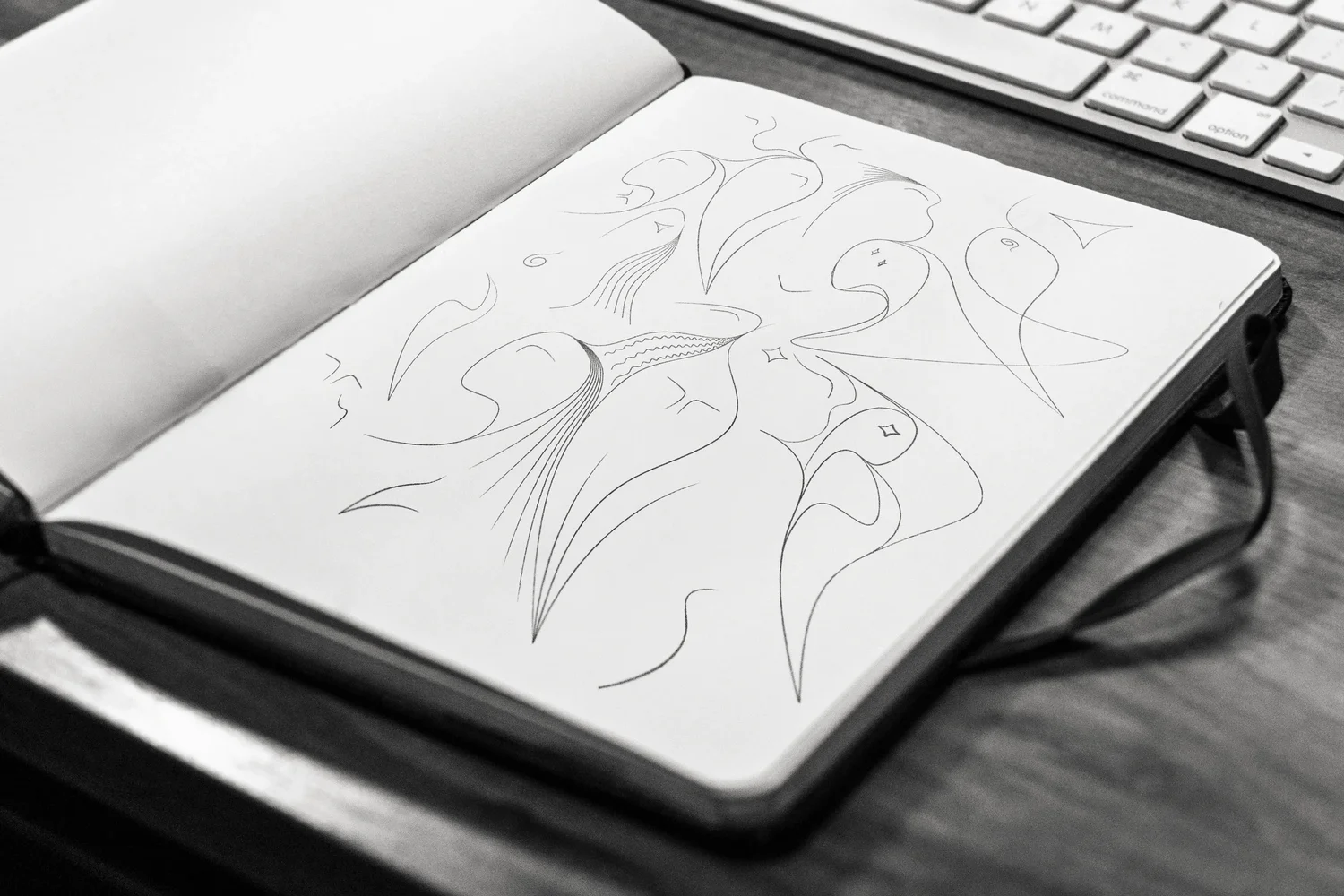


The nameDifférence + France
The name in three steps. Différence. Différance: the E becomes an A. Diffrance: the É drops out, and France appears inside the word.
Test captionMontserrat Medium
The palette.
The DOM/TOM, Françafrique, Indochina, French Polynesia: all these peripheral Frances are present in the chromatic palette, without being named.
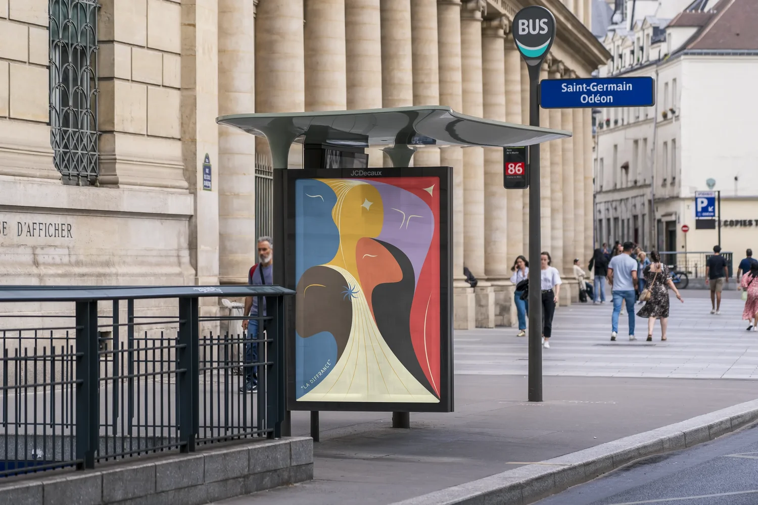
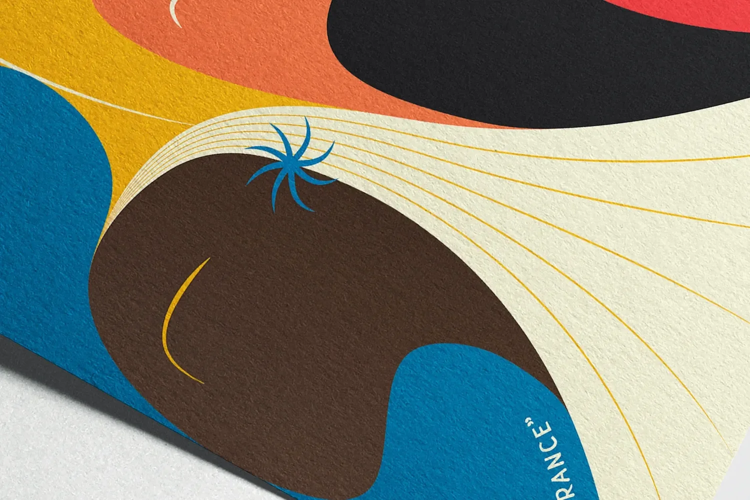
La Diffrance · 2022
One word.
Two meanings.
One identity.