

MOR-0526 · Case study 01 / 06Islington, London N1
Two Nepalese, one Turkish: three friends who opened a café on Upper Street in January 2025 with a shared interest in specialty coffee and food. The name was already there. The brief was to give it a mark that could hold all of it without signalling any of it.
- Year
- 2026
- Client
- Morr Café London
- Role
- Brand Identity & Strategy, Print Design, Web Design
- Type
- Commissioned
The mark.
Four letters on a shared stroke weight and geometry.
The mark started with the R, which came from looking at Devanagari, the script used to write Nepali. The character र shares the Latin R’s stem, counter and leg, but its leg ends at an angle that is not quite Western. That angle is in the Morr R, unmarked and unexplained, and it set the rules the other three letters follow.
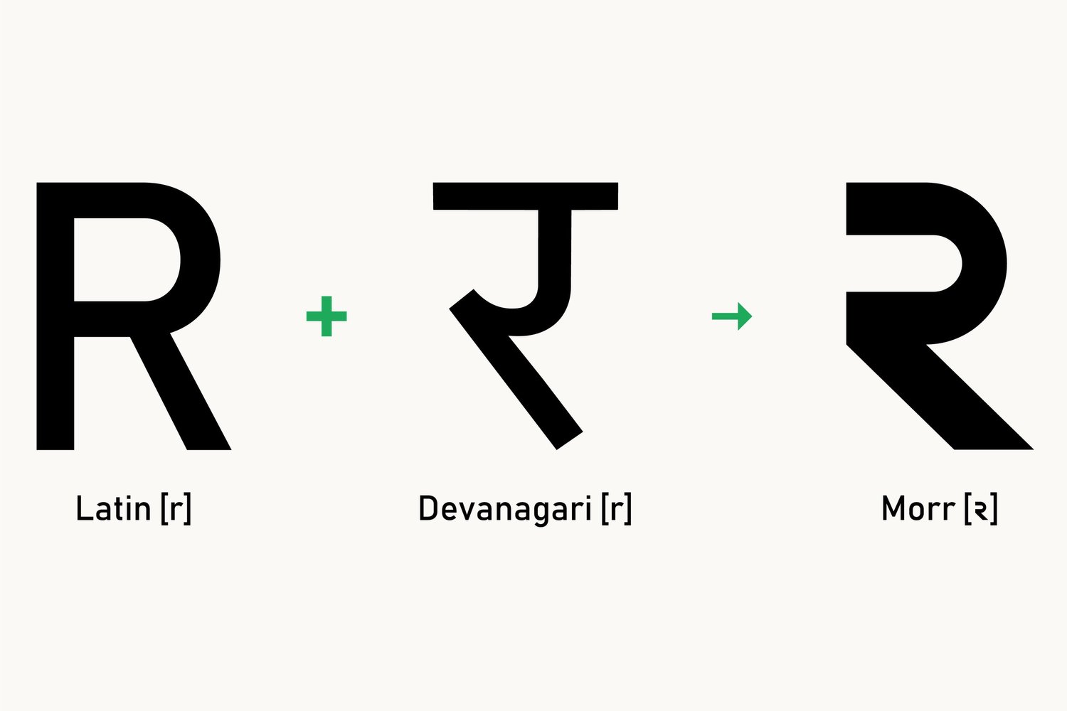
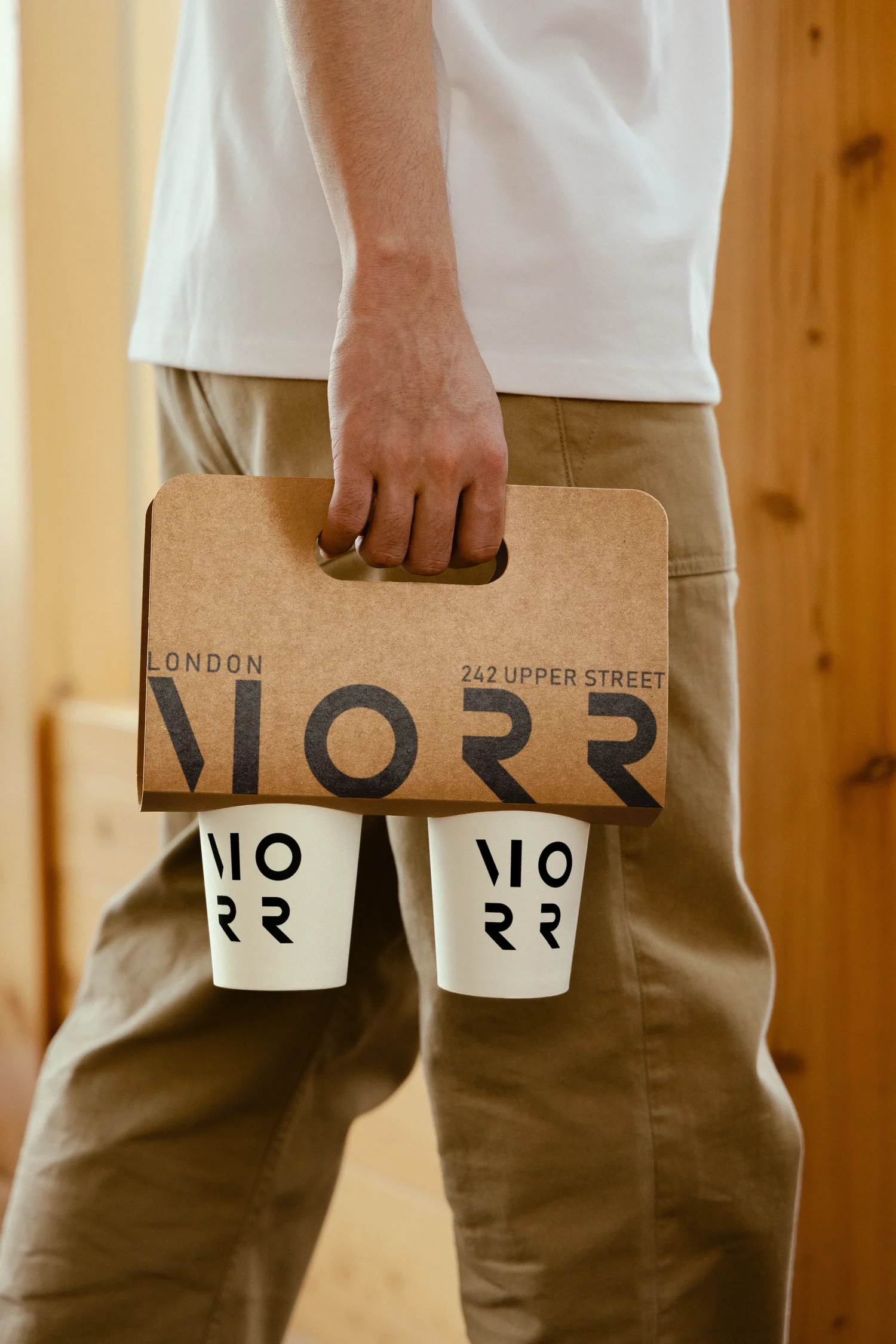
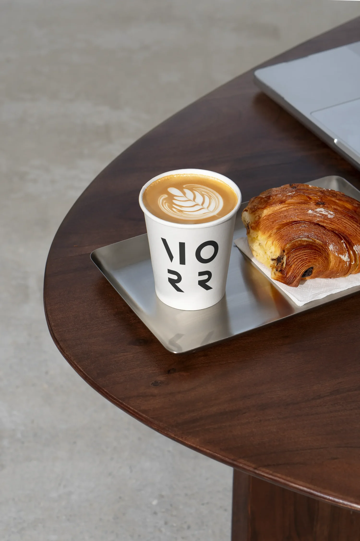
The rest of the wordmark was drawn from the R, with no typeface adapted and no letterforms borrowed. The M takes its stem and diagonal; the O is a perfect circle at the same weight. The name reads without effort and holds as one unit on a cup, a counter sign or the foot of a menu.

In use.
Contrast ratio 16.8 to 1
Black and white was not a convenience; it was a commitment. The identity needed to project the same qualities the café does: directness, confidence, an absence of anything superfluous. Colour would have introduced hierarchy between the two founding cultures; the absence of it places them on equal ground. The palette is a statement about what Morr is, made visible before a single dish is ordered.
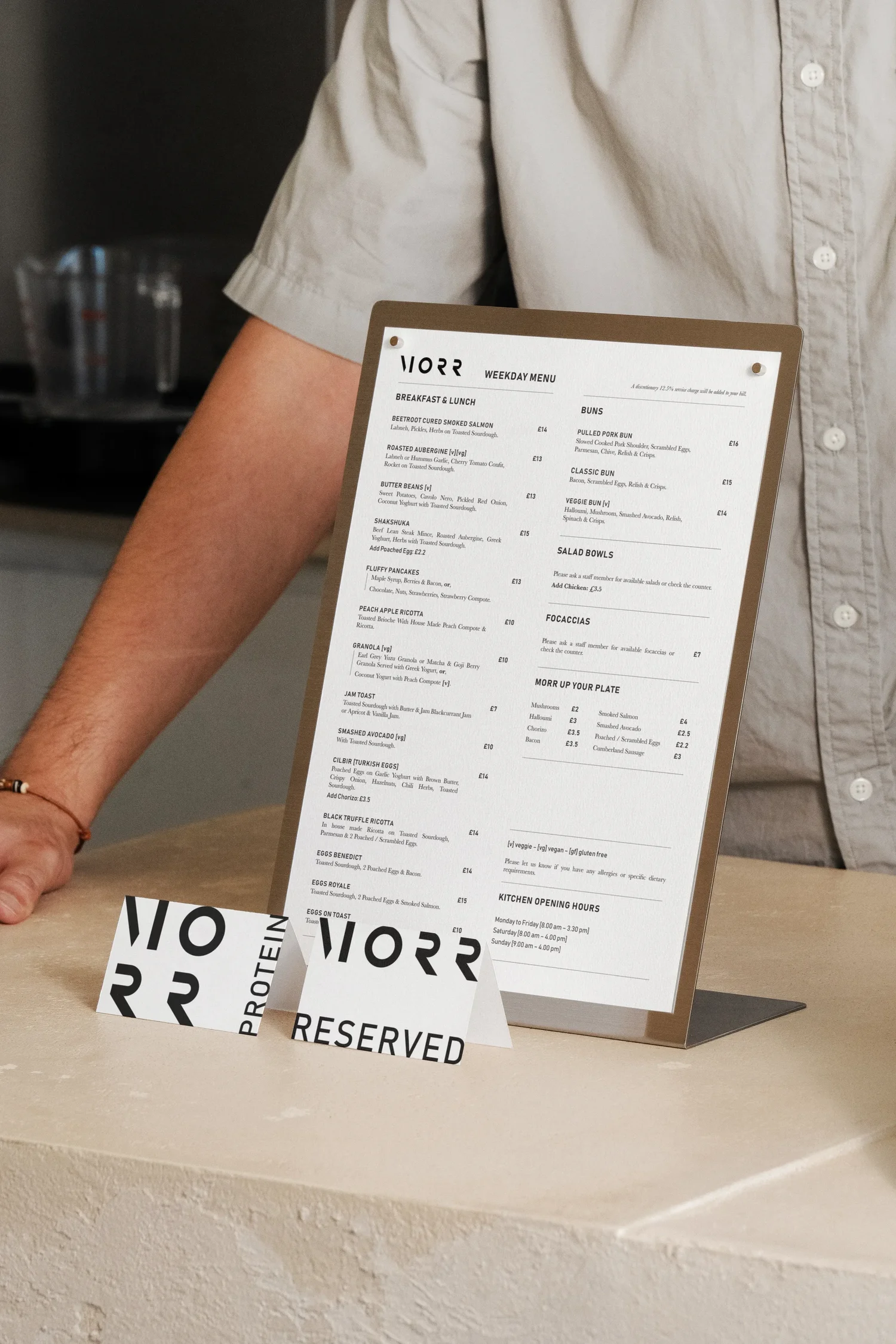
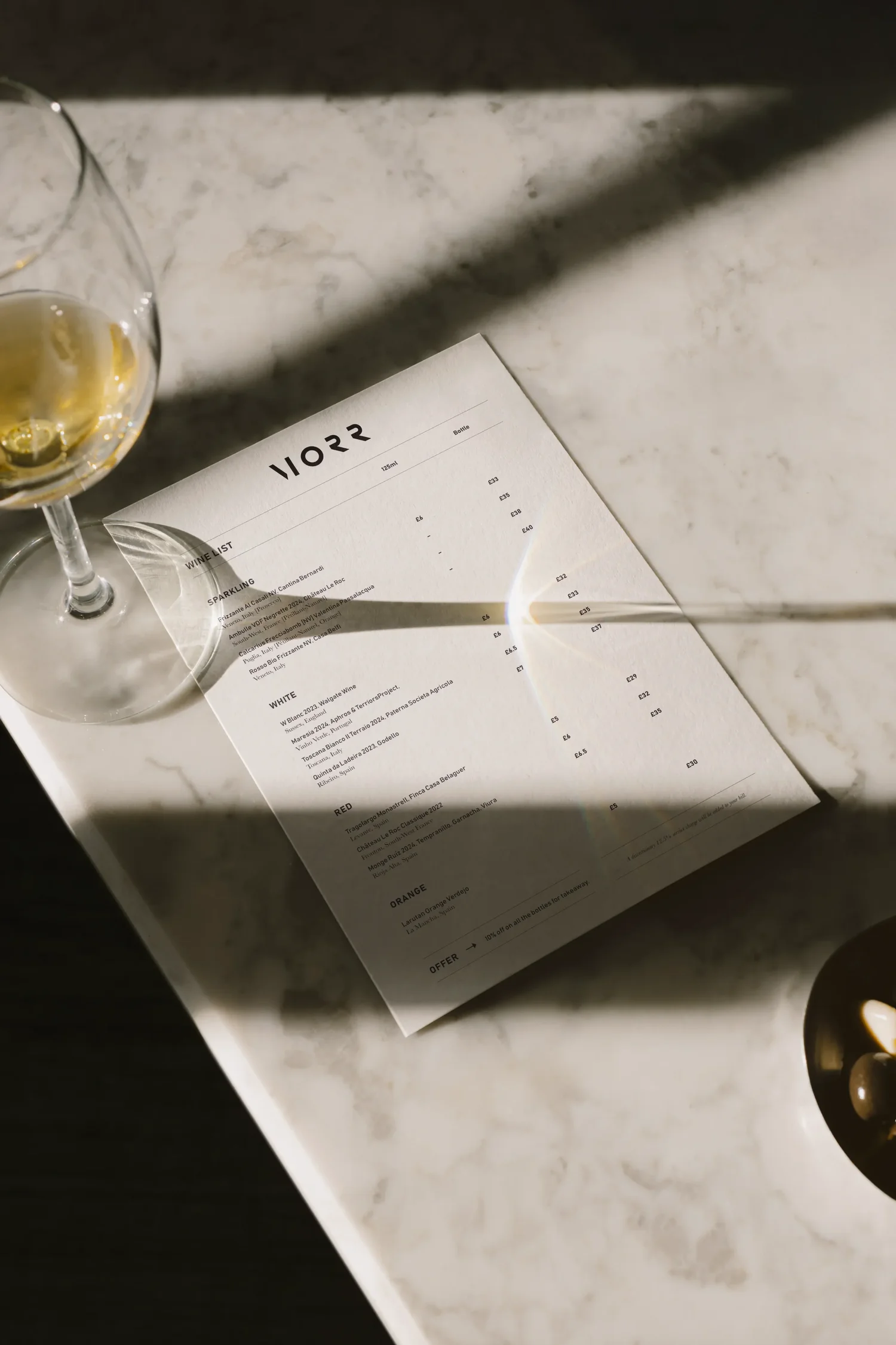
The menu system holds three distinct occasions in a single typographic logic. The weights, the hierarchy and the position of the wordmark remain constant. What changes is the register. A weekday brunch reads with density and purpose. An evening menu breathes differently, closer to a restaurant than a café. The system allows for that shift without the identity fragmenting. One mark, different moments.
The monogram.
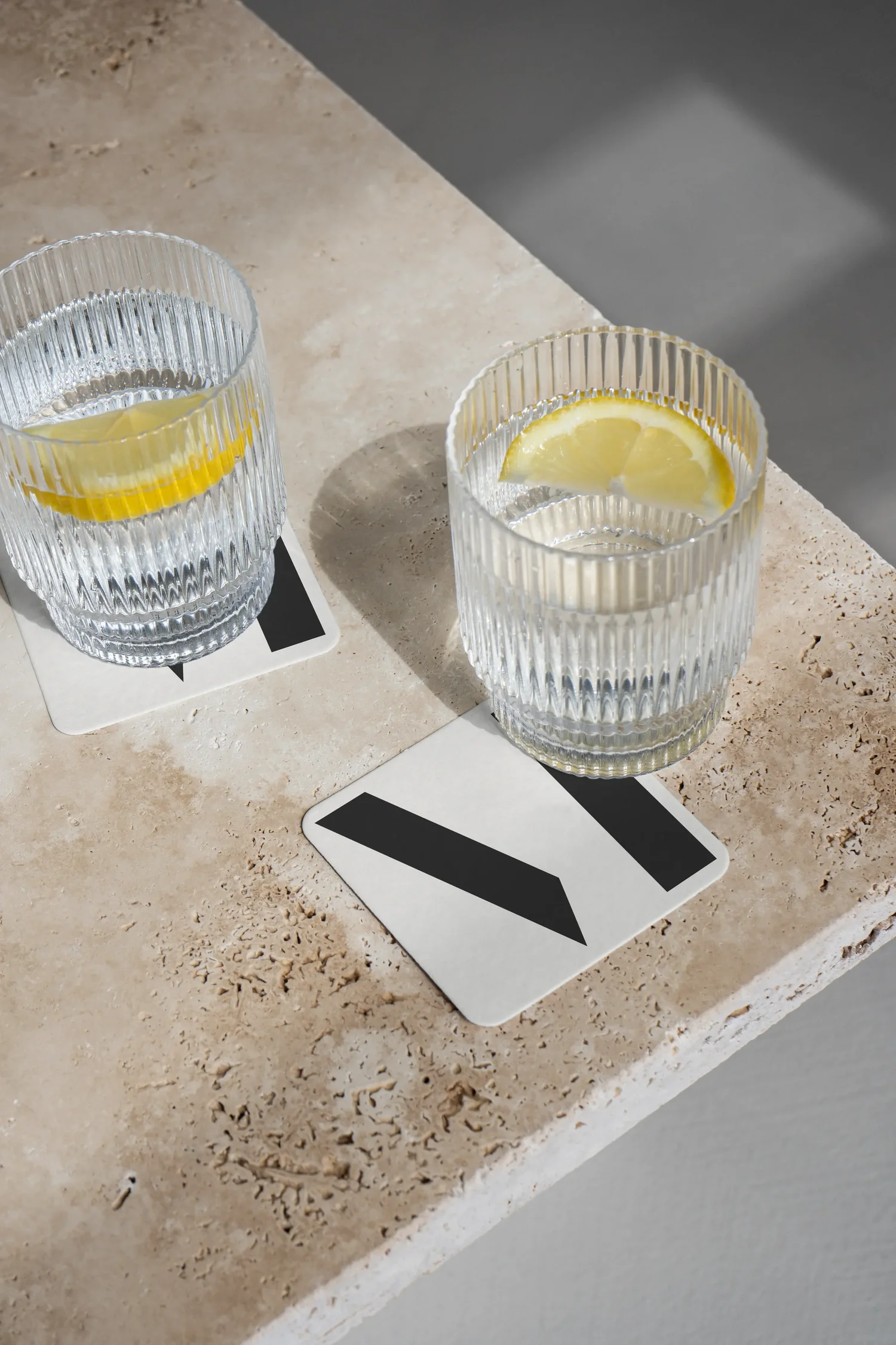
The M derives directly from the language of the R. It is built from the R’s two straight strokes, a vertical stem and a diagonal, at the same weight and on the same geometry. Because of that, a single letter can carry the whole identity. Where the full wordmark anchors the menu and the counter, the M works as the identity’s icon, at the scale of a cup, a label or a stamp. The monogram was never designed separately.

The identity online.
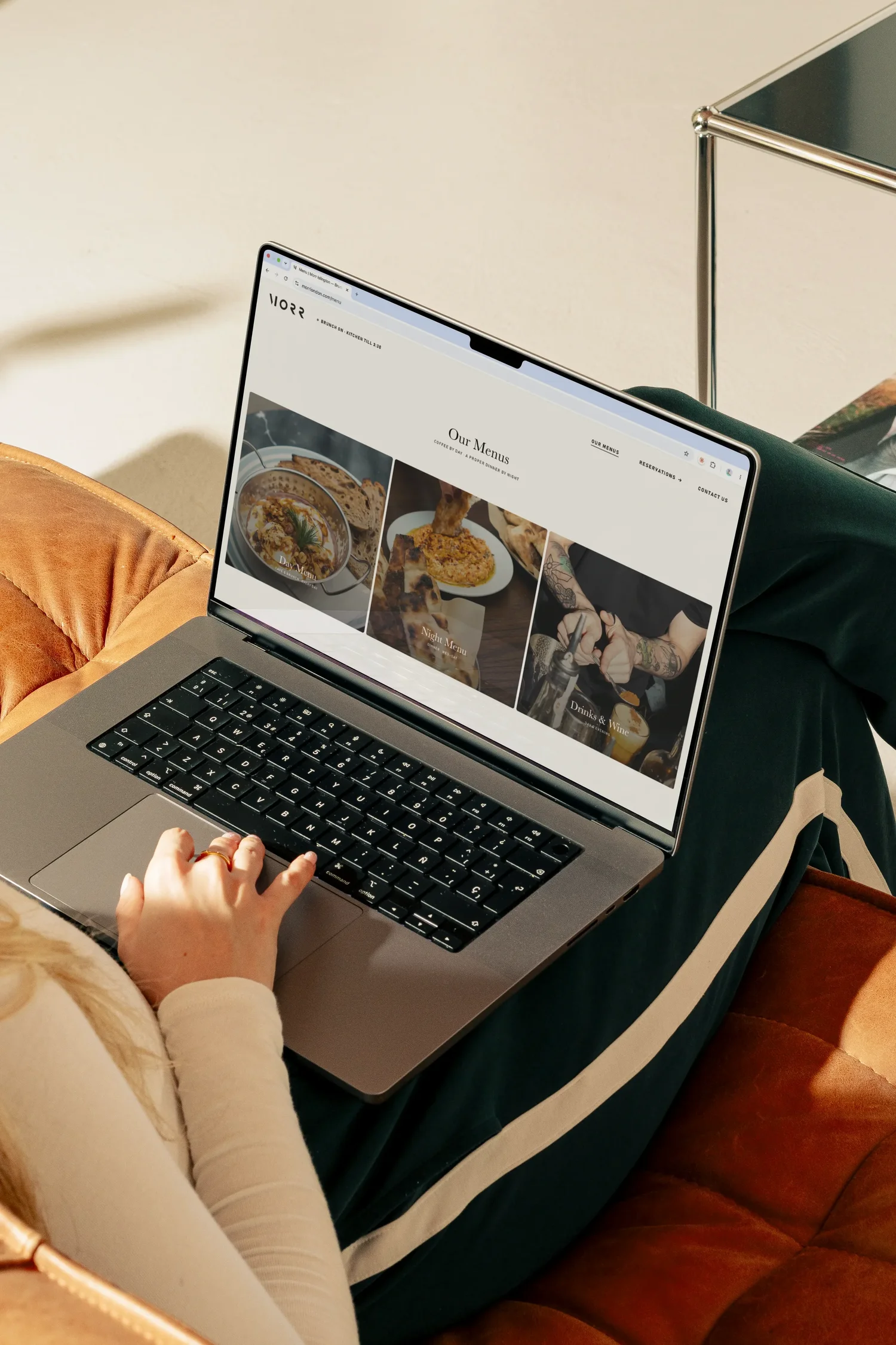
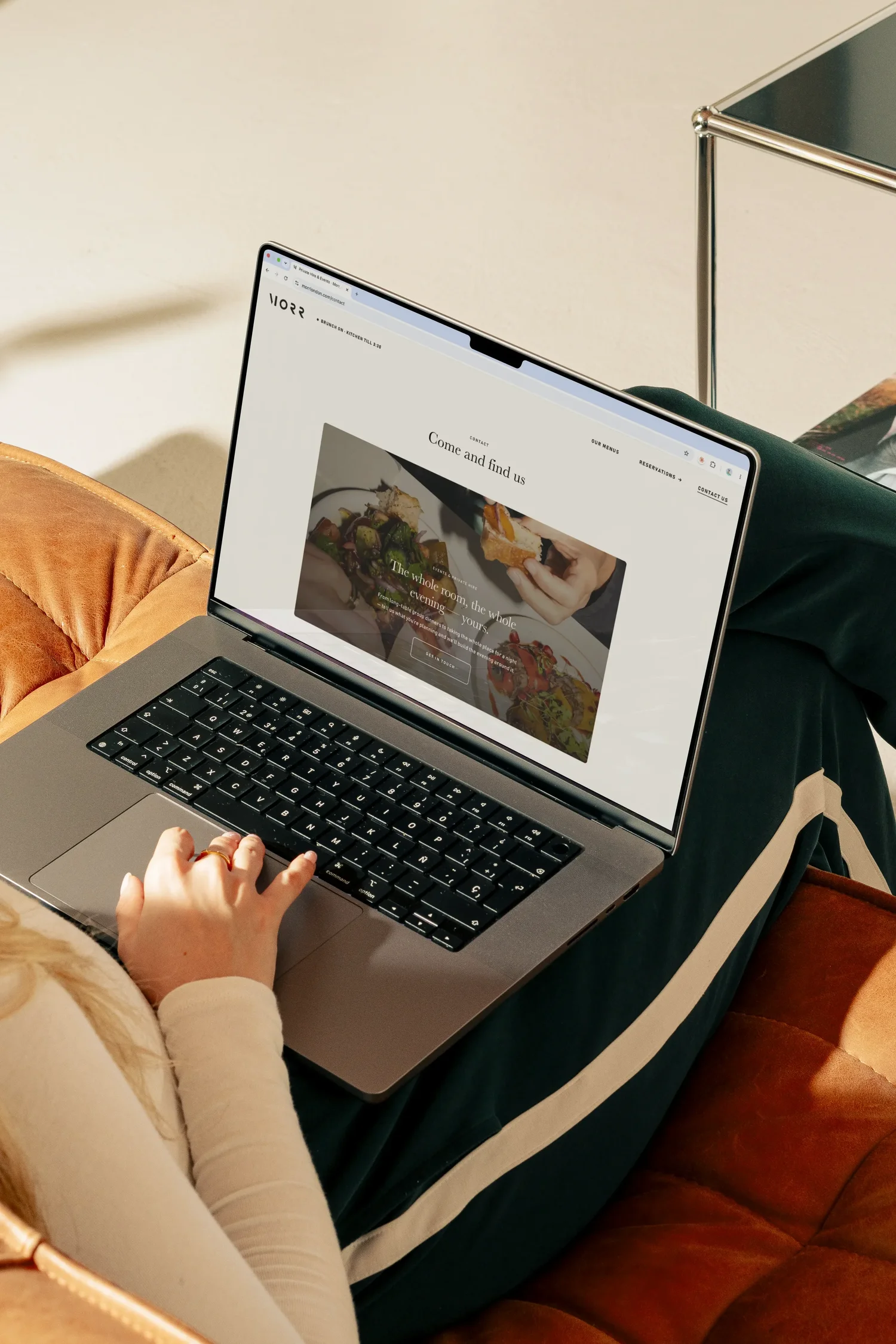
The website is where the identity has to carry a feeling, not just a mark. Morr is warm without being soft: three friends, an open kitchen and a room that shifts from a bright weekday brunch to something quieter after dark. Black text on an off-white ground, generous space and the wordmark at the top of every page carry the same restraint as the identity. A visitor should sense the place before reading a word about it.
Type carries most of the atmosphere: the menu, the story and the hours are set in the two weights of the print system, so the site reads as one voice rather than a template filled in. Layout follows the golden section the studio uses across its own work, so the pages feel settled at any size, from a phone in the queue to a laptop at a desk. Since launch, more of the right people find Morr and book a table before they arrive.

Morr Café · 2026
One mark.
No colour.
Everything in the letterform.