
![피어나다 [Pienada], medal design for the Gangwon Winter Youth Olympic Games 2024](https://images.squarespace-cdn.com/content/69ca6cca3b28505e5831e663/be41397a-e943-4134-bae0-3ff1bbbfe1ab/Mockup+01.webp?content-type=image%2Fwebp&format=1500w)
PND-0124 · Case study 04 / 06Gangwon, South Korea
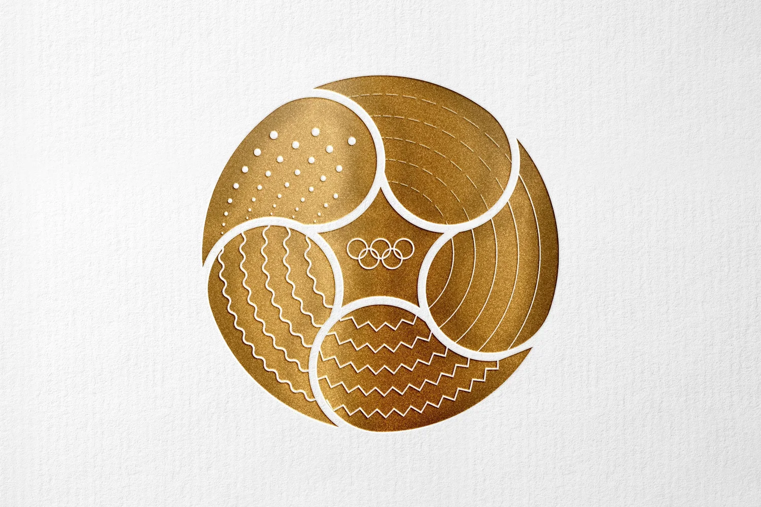
The design of this medal tells a story. It is the story of the evolution of the Olympic athlete through five core values: commitment, consistency, sacrifice, patience and hard work. This story is represented on the medal in a clockwise narrative, starting from the top, told through the petals of the Mugunghwa, the Hibiscus syriacus, to render homage to the Republic of South Korea through its national flower.
- Year
- 2023
- Client
- Winter Youth Olympic Games Committee
- Role
- Creative Direction, Research, Graphic Design
- Type
- Competition entry, medal front
The story.이야기.
Five Olympic rings. Five petals. Five values. One story told clockwise from the top.
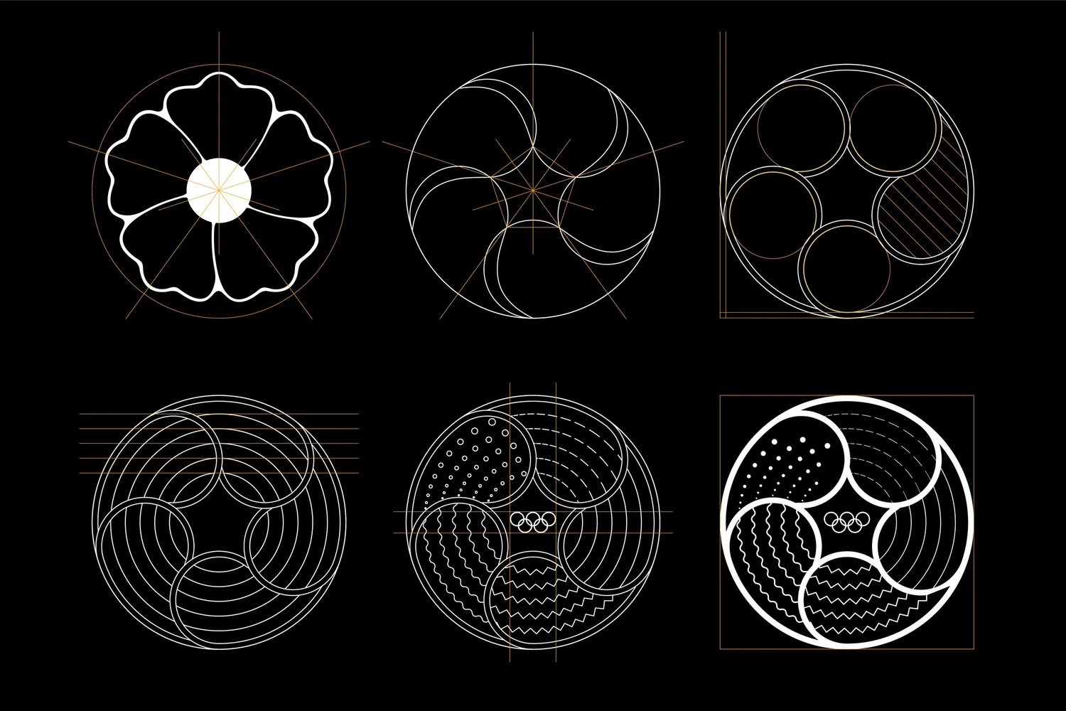
The brief asked for a medal, but the research revealed something more specific: a question of cultural authorship. The medal had to be both universal, legible to any athlete from any country, and rooted in the specific geography and culture of its host nation. The Mugunghwa provided the answer. South Korea’s national flower is not incidental to Korean identity: it appears in the national anthem, in the coat of arms, in the name of the country itself in certain poetic traditions. A flower that blooms and reblooms without ever fully fading: the botanical fact and the cultural meaning aligned perfectly with the logic of an Olympic athlete’s development. The five petals were not chosen for their visual appeal. They were chosen because they were already there.
The geometry of each petal was derived from the movement patterns of winter sports: the ski mark, the speed skate’s arc, the snowboard’s carved turn, the bob run, the biathlon’s trajectory through snow. These are not decorative lines. Each one was traced from reference. As they accumulate across the five petals, from fragile dashes to a single resolved circle, they carry the same visual logic as a training diary: irregular, effortful, gradually converging on mastery. The decision to read the medal clockwise was not arbitrary. Korean ceremonial objects, from temple drums to royal seals, are traditionally engaged clockwise. The medal asks its wearer to rotate it, to discover the story from beginning to end. The victor earns the reading.



The values.가치.
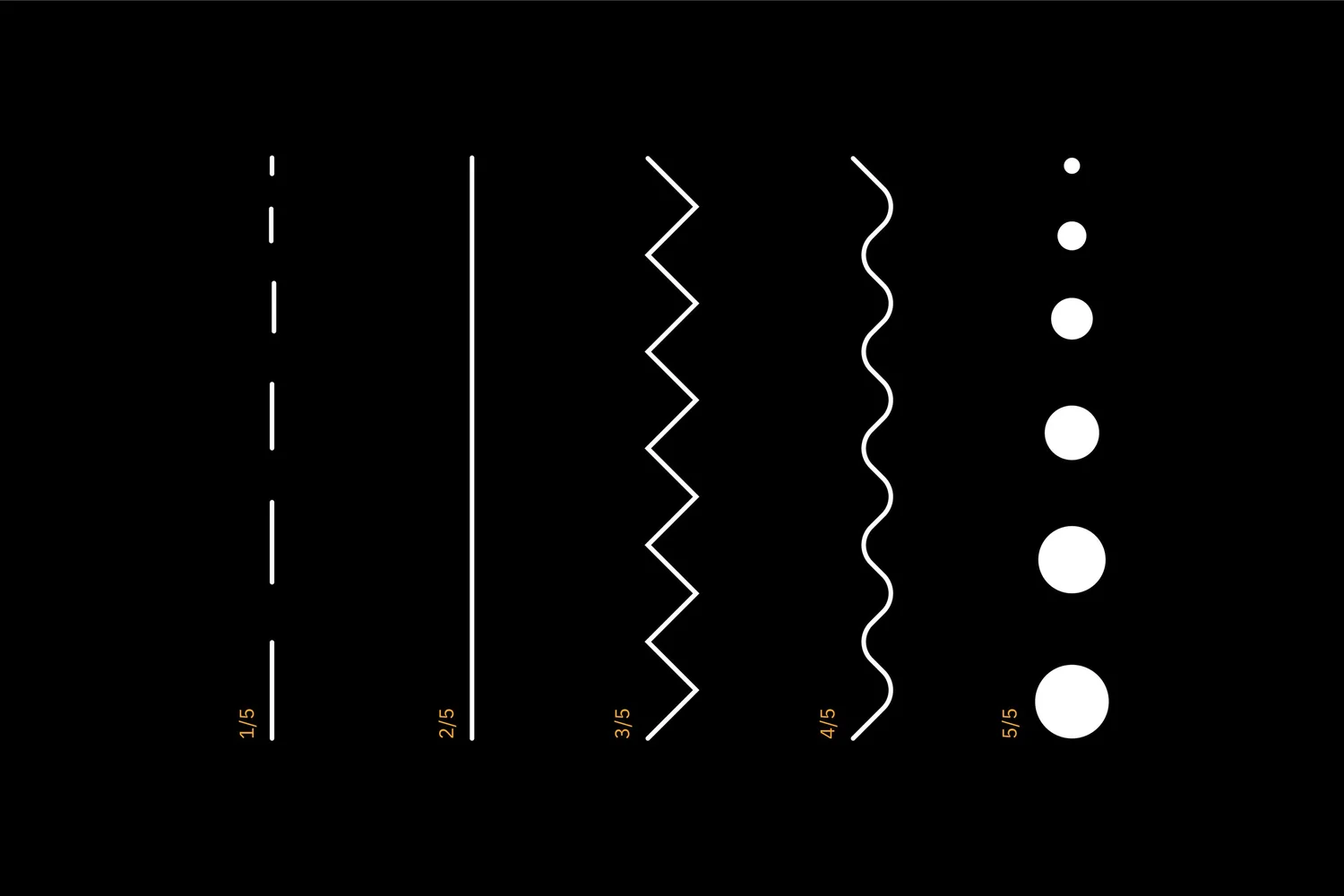
First, the athlete must be committed to their passion: the lines are dashed, becoming longer as commitment increases. Second, they must learn consistency: the lines are continuous. Third, sacrifice: the zigzag lines represent hardship. Fourth, through patience, the athlete starts to flow with their sport. The athlete and their discipline become one, on the same wavelength as they synchronise. Finally, through hard work, the individual becomes a perfect athlete, an Olympian, symbolised by a circle.
The medal’s design blends these values harmoniously, representing the athlete’s journey in geometrical shapes inspired by winter sports: snow, ice, water, ski marks and snow tracks. The lines on the first petal are thin, symbolising the fragility of the beginner athlete. Through the journey, the lines gain weight to represent confidence and mastery. While many athletes compete against you, represented by the five lines, in the end, there is only one circle standing by itself: the victor.
The five valuesThe path of the victor


The rings.올림픽 링.
Construction, isolation area and minimum size.
One ring is equal to twelve times the thickness of a ring. The space between two rings is equal to the thickness of one ring. The isolation area corresponds to one quarter of the diameter of a ring, and must be free from any element: no other element should overlap the Olympic rings.
For a composite logo, the isolation area is defined by one half the diameter of a ring. The additional clear space ensures that the two entities are clearly separated and do not look like a single combined logo. The Olympic rings should appear no smaller than 8mm or 30 pixels wide.

Pienada · 2023
Five petals.
One story.
A medal that earns its meaning.