
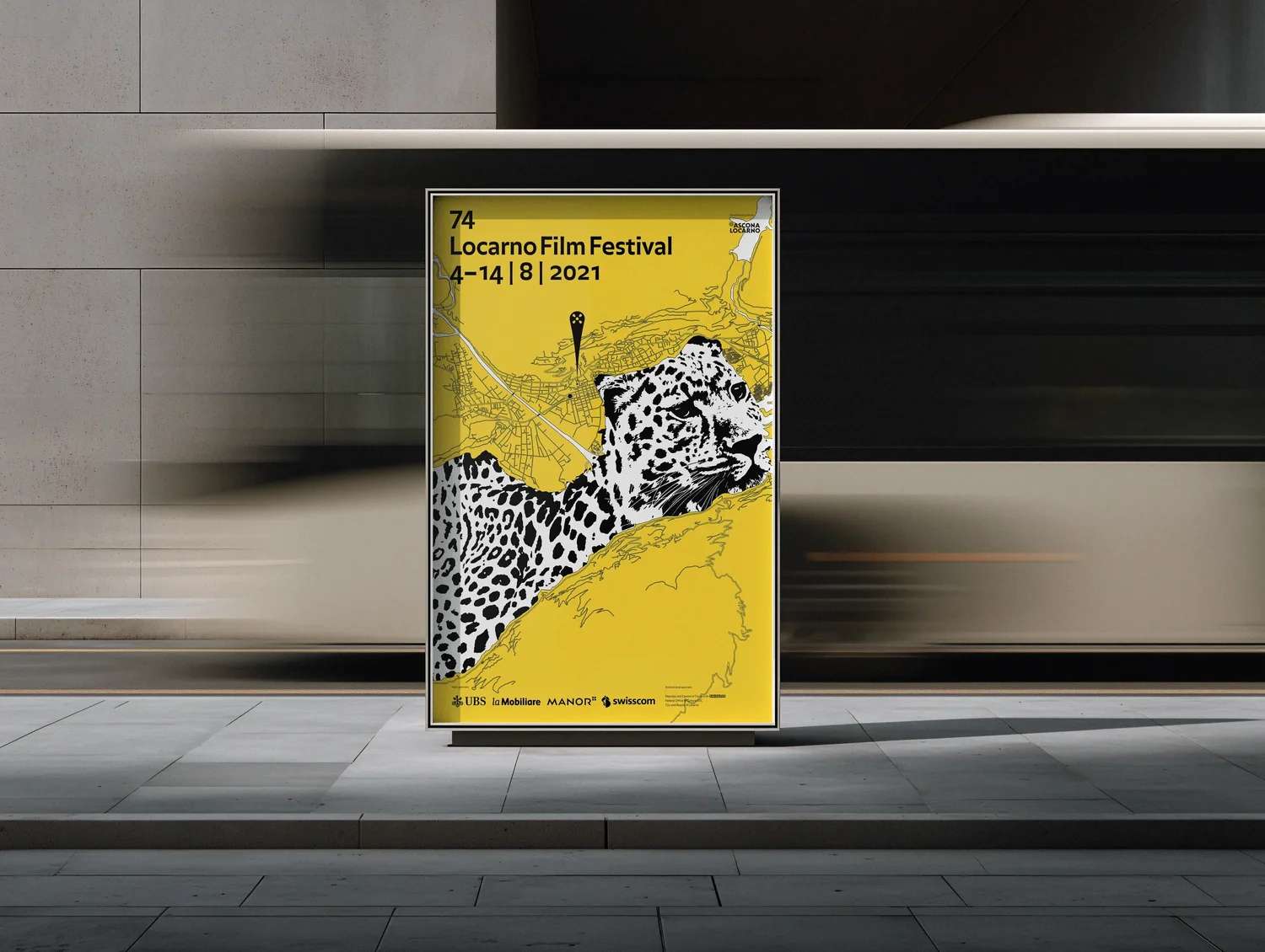
YLO-0821 · Case study 03 / 06Locarno, Switzerland
Each year, the Locarno Film Festival invites designers to submit poster proposals for its annual edition. Locarno is one of the oldest and most distinguished film festivals in the world: eleven days each August when a small Swiss-Italian town at the edge of Lake Maggiore becomes the international capital of auteur cinema.
- Year
- 2021
- Client
- Locarno Film Festival
- Role
- Creative Direction & Graphic Design
- Type
- Speculative
The discovery.
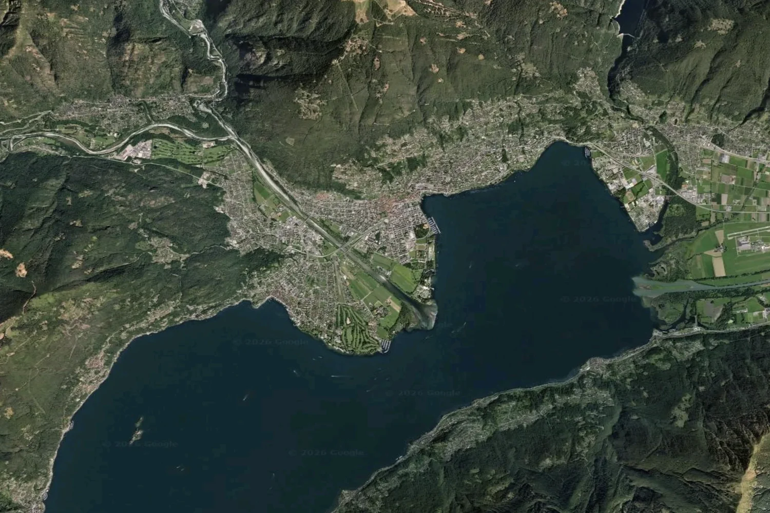
The shoreline of Lake Maggiore already draws a leopard.
The leopard is Locarno’s emblem, and the festival’s top prize carries its name: the Pardo d’oro, the Golden Leopard. The town sits at the northern end of Lake Maggiore, and on the map the lake’s outline traces the silhouette of a leopard.
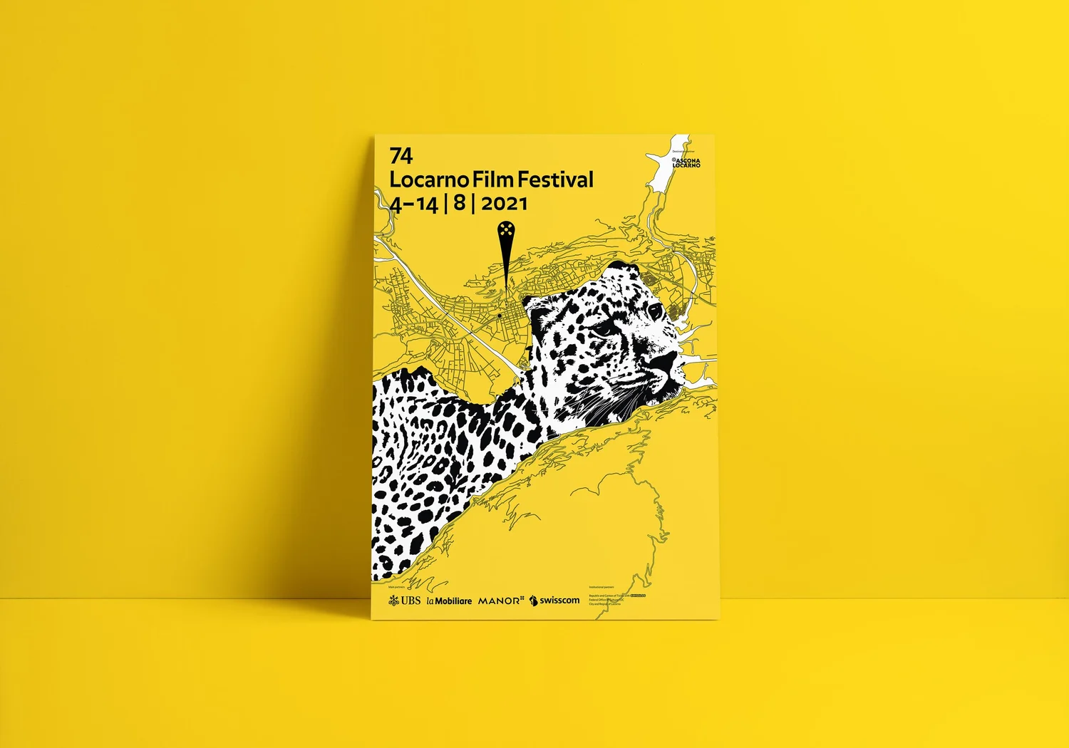
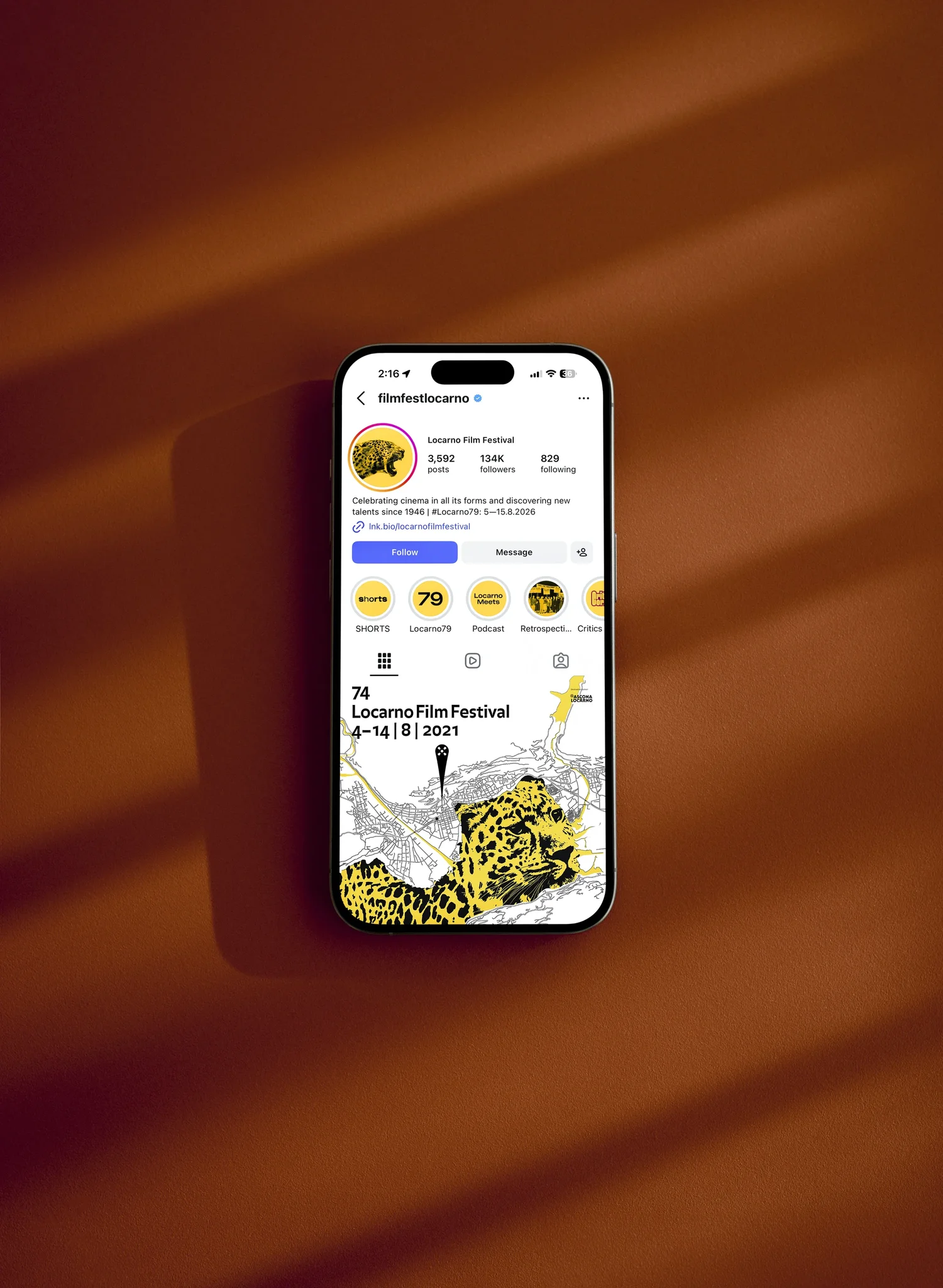
The poster is built on that discovery. It draws the lake as a map and lets the leopard appear in its shoreline, so the festival’s symbol comes from the place that hosts it. The animated map below shows the outline becoming the animal.



The palette.
Contrast ratio between Giallo Pardo and Nero: 12.5 to 1
Contrast ratio between Nero and Bianco: 21.0 to 1
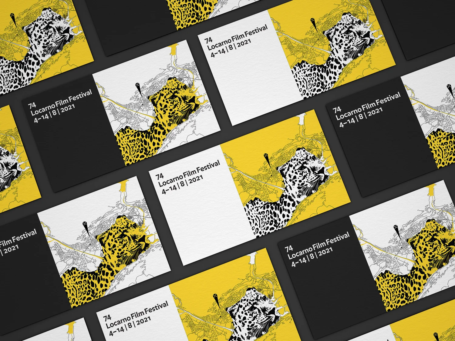
Yellow, black and white: the festival’s own colours, and nothing else. Three flat colours keep the poster legible at every size, from a billboard to a phone screen.
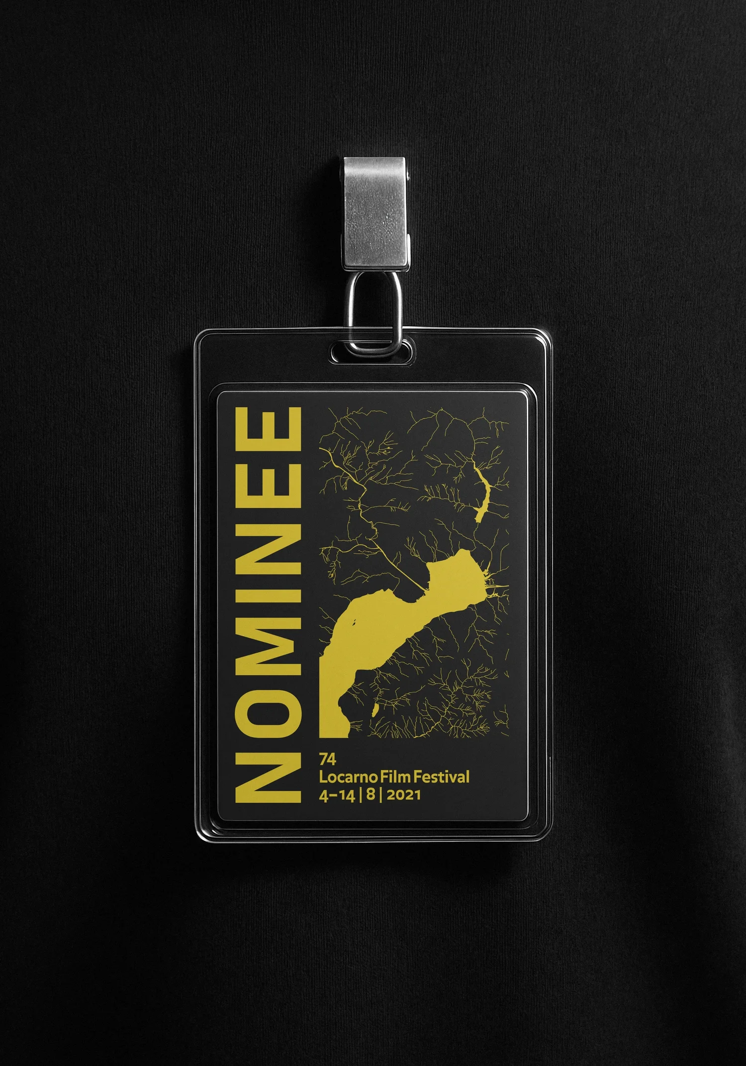
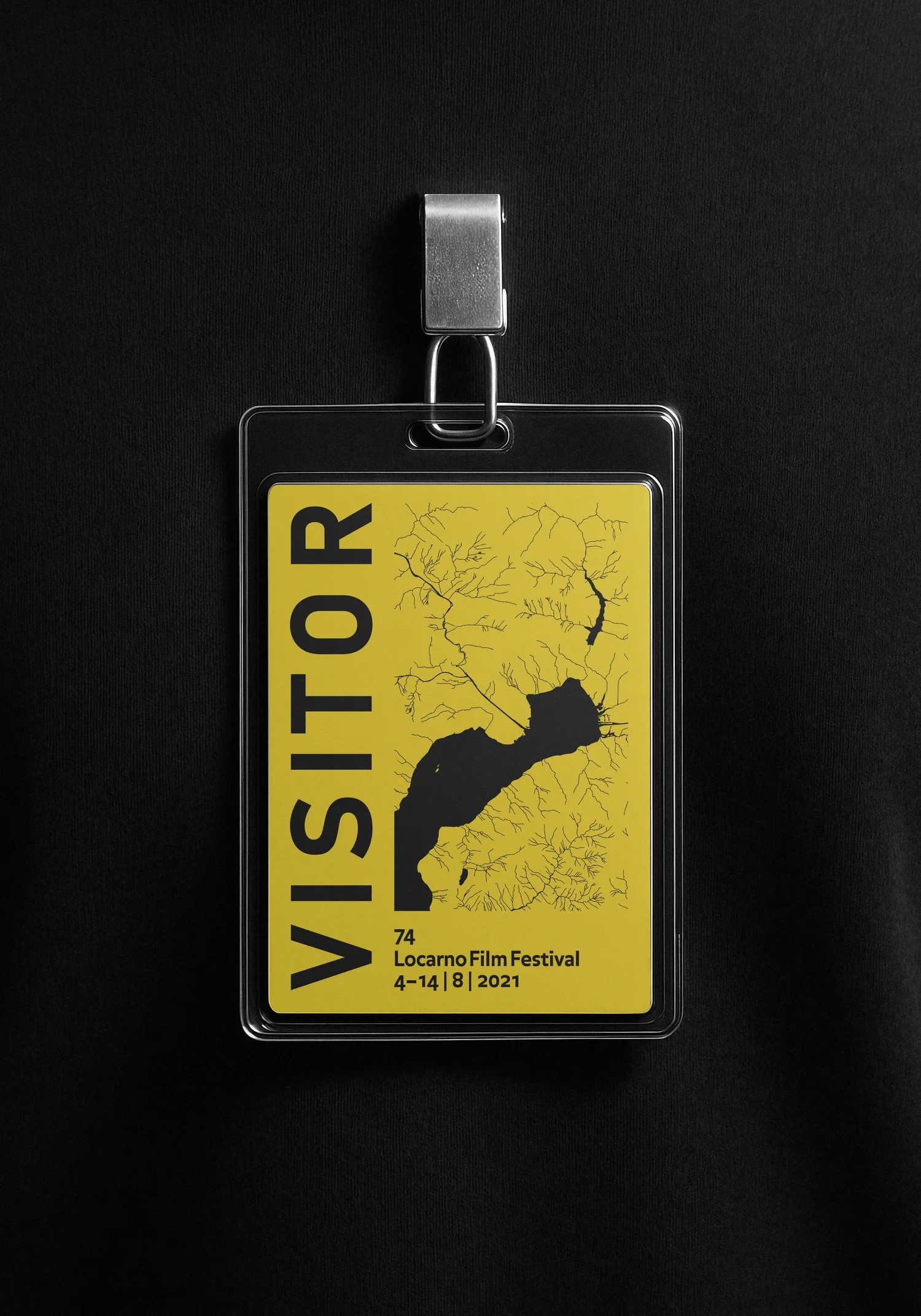
The palette also inverts. Yellow on black and black on yellow read as the same poster, which is how it runs on the billboards and on the tote bag.



The Yellow Leopard · 2021
Three colours.
One icon.