YBJ
for Yara B Joude (S.A.R.L).
The idea.
Yara B Joude (S.A.R.L) is a Moroccan company founded by Malika Bouchama and Mustapha Bazzoun, authorised to manage, operate, renovate and sell hospitality and tourism properties — riads, hotels, residences, holiday villages, sports clubs, cafés. At the heart of its activity: "Chez LAJWAD," an eco-tourism accommodation set in the Dakhla region, at the edge of the Sahara. The project brings together twelve Berber tents, an ecolodge built from local materials, a Saharawi kitchen and méharées at the heart of the desert. A response to the regional shortage of eco-tourism offerings, and an invitation to listen to silence — the silence that Bedouin culture has known how to inhabit for millennia.
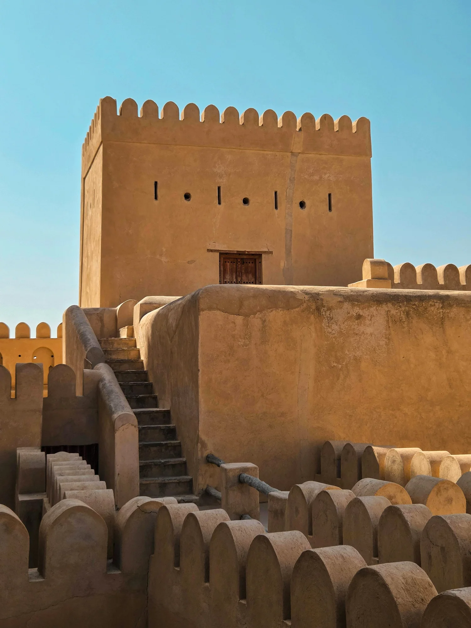
The desert is beautiful because it does not lie.
It must be approached with respect.
— THÉODORE MONOD (1902–2000)
The brief was simple: design a logo for Yara B Joude (S.A.R.L), a Moroccan company founded in Dakhla by Malika Bouchama and Mustapha Bazzoun. The research, however, demanded something deeper — to understand the territory, its culture, the philosophy of a project that places the desert at the heart of its identity. The Dakhla region, on the southern edge of the Kingdom, is not a backdrop among others: it is a threshold. Between the Atlantic and the Sahara, between the urban and silence, between Saharan tradition and a modernity still to be invented.
The invitation extended by "Chez LAJWAD" — the eco-tourism accommodation at the heart of the project — is not that of a hotel. It is that of a posture. The naturalist Théodore Monod, who spent his life crossing the Sahara, wrote it this way: "The desert is beautiful, it does not lie, it is clean. That is why it must be approached with respect." Those words guided the project. The logo had to carry the same rigour — clean, without excess ornament, elemental in its structure. But it also had to bear witness to the beauty that sometimes emerges from austerity itself. A flower in the stone. A geometry in the sand.
Hover or tap the star
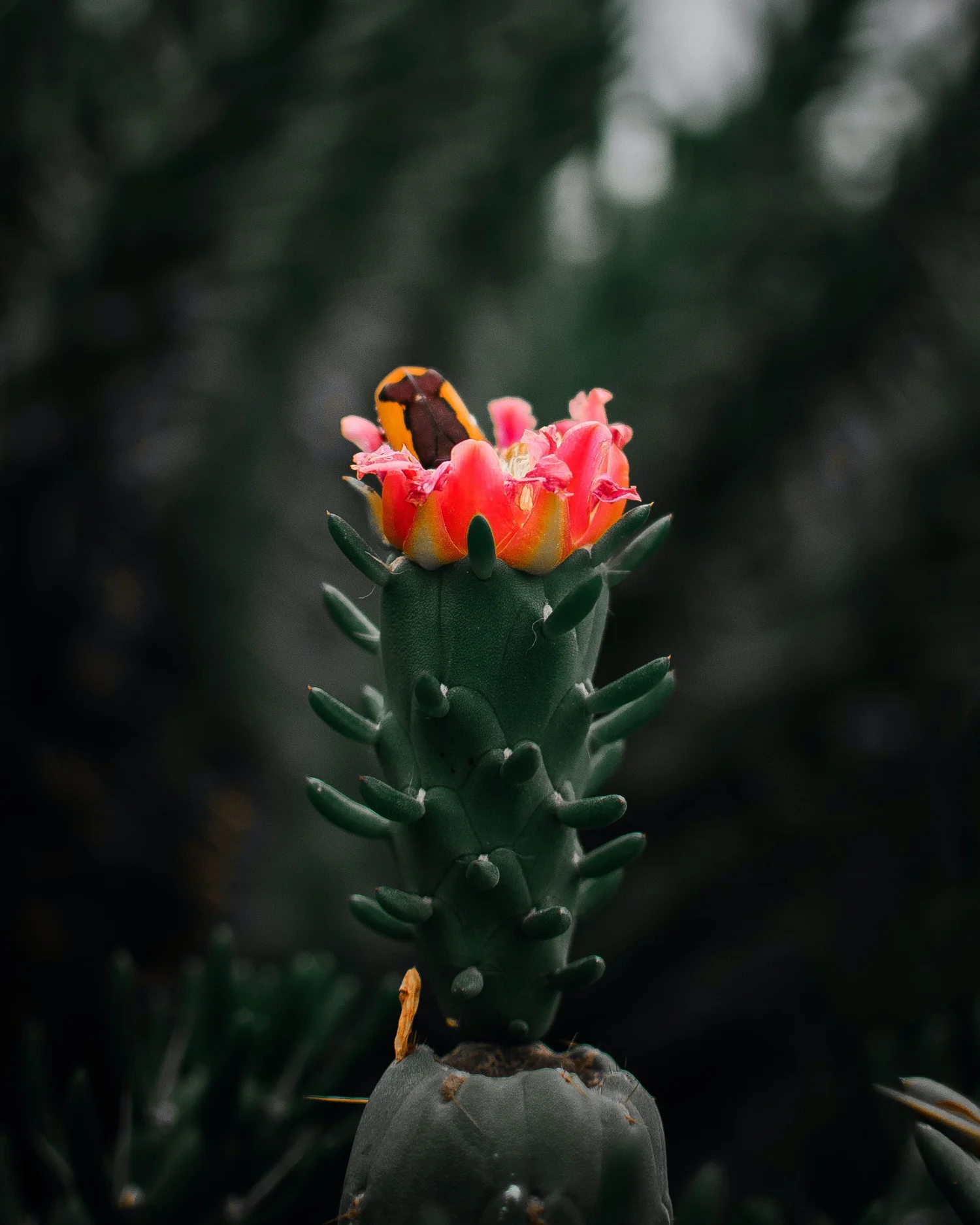
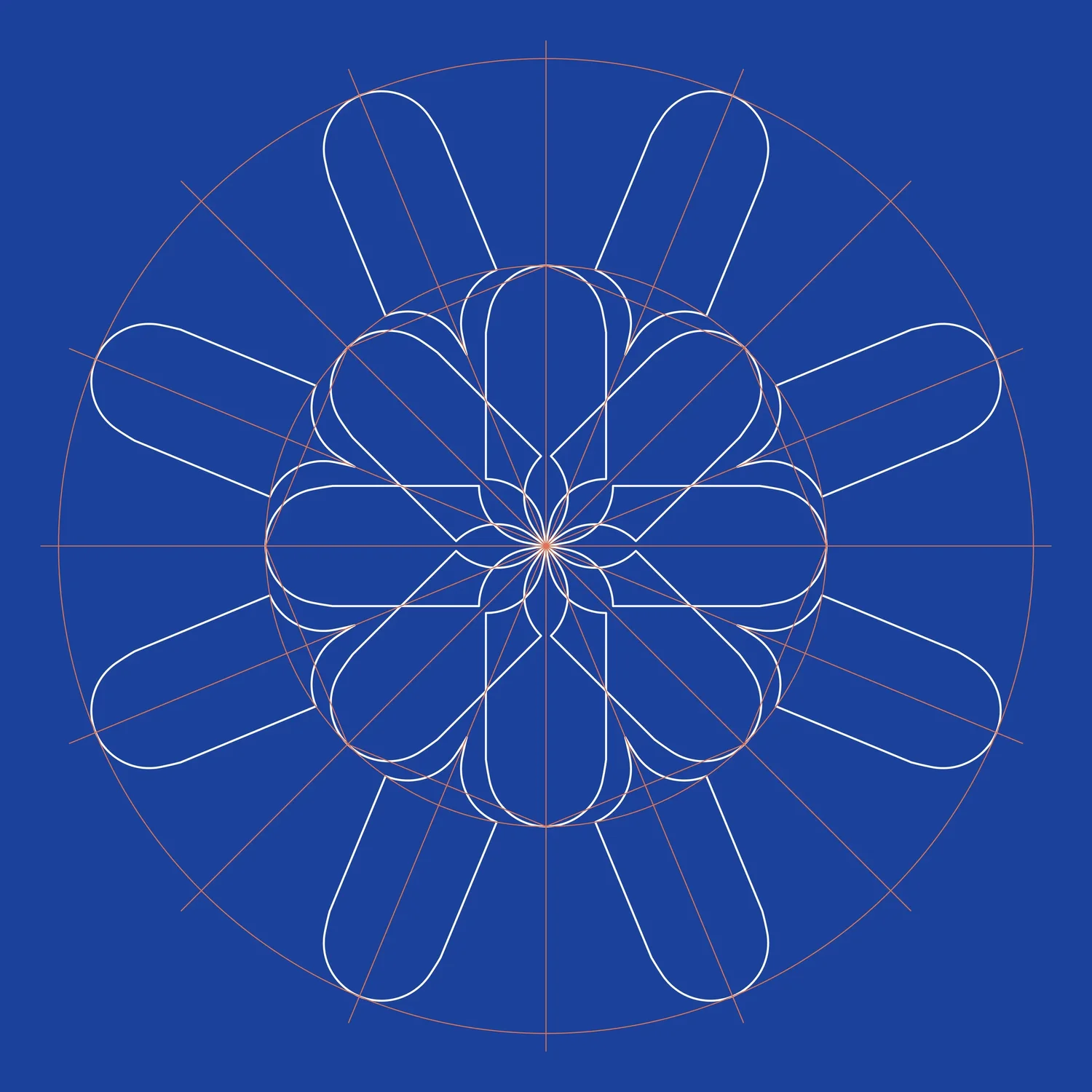
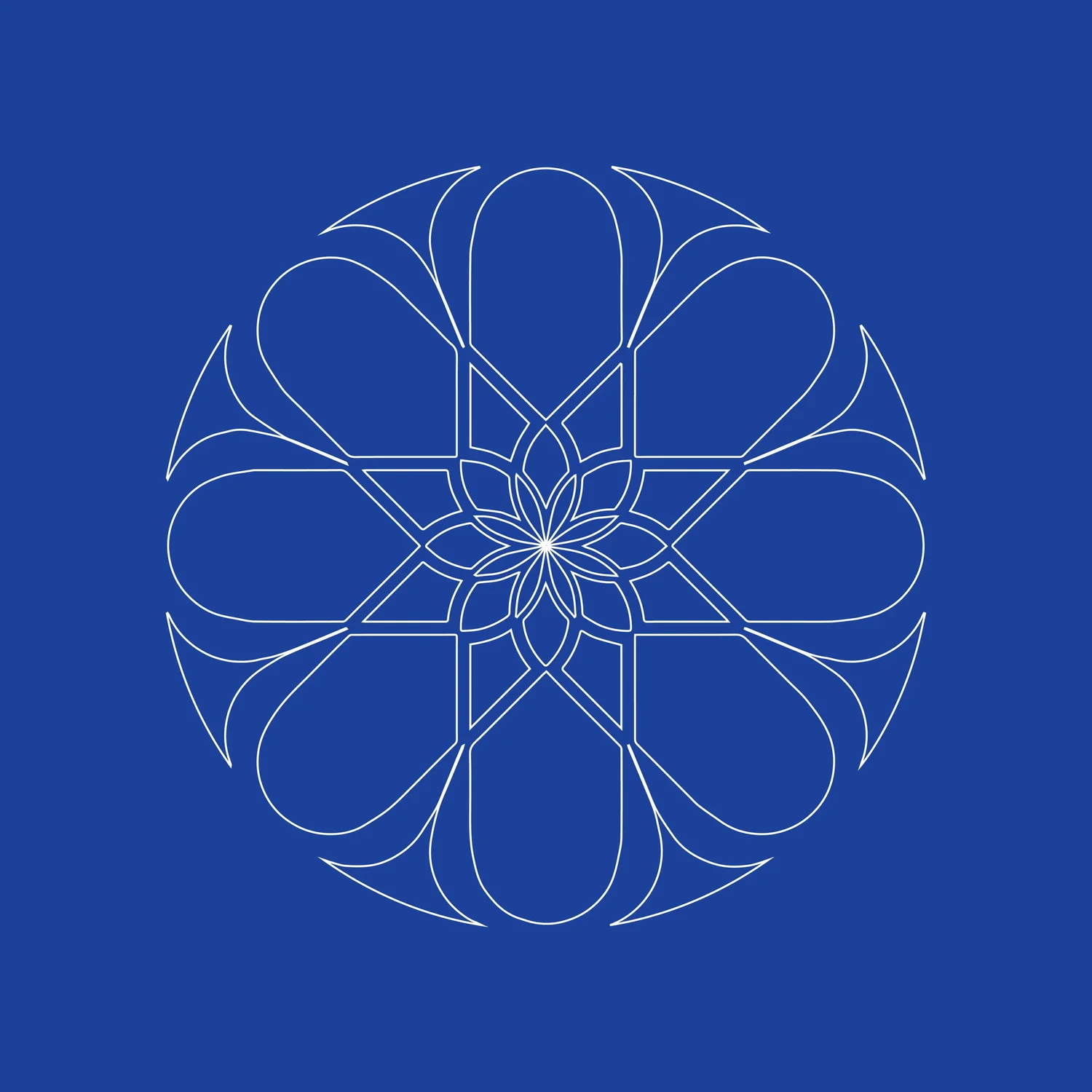
The central motif of the identity was borrowed from a single plant: the Austrocylindropuntia subulata, better known as "Eve’s needle cactus." Native to the high Andean plateaus, this plant has colonised Morocco with remarkable discretion. It grows where nothing else grows. Its tips bear an almost incongruous red flower — intense against the rigour of the landscape that surrounds it. This double nature — austerity of structure, intensity of detail — embodies precisely what Chez LAJWAD seeks to offer: the meeting between the asceticism of the desert and the generosity of a bloom.
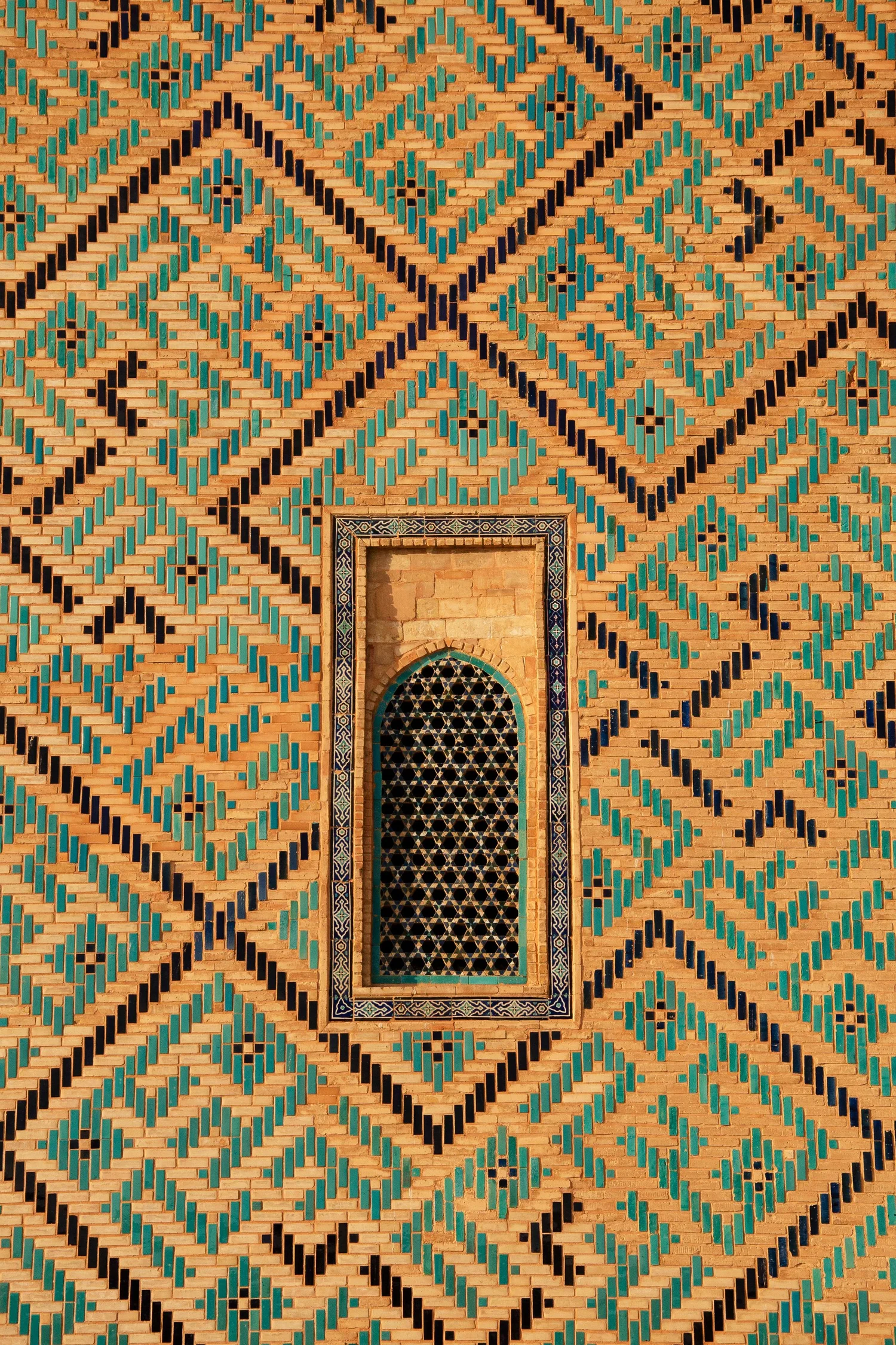
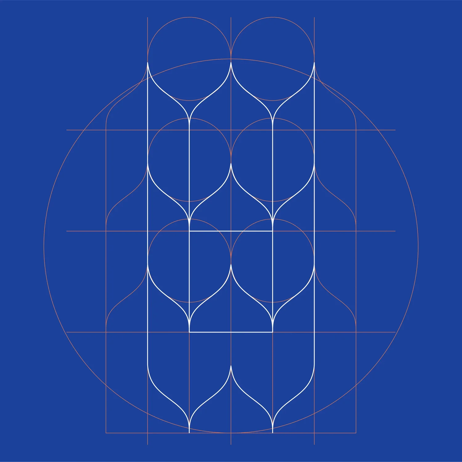
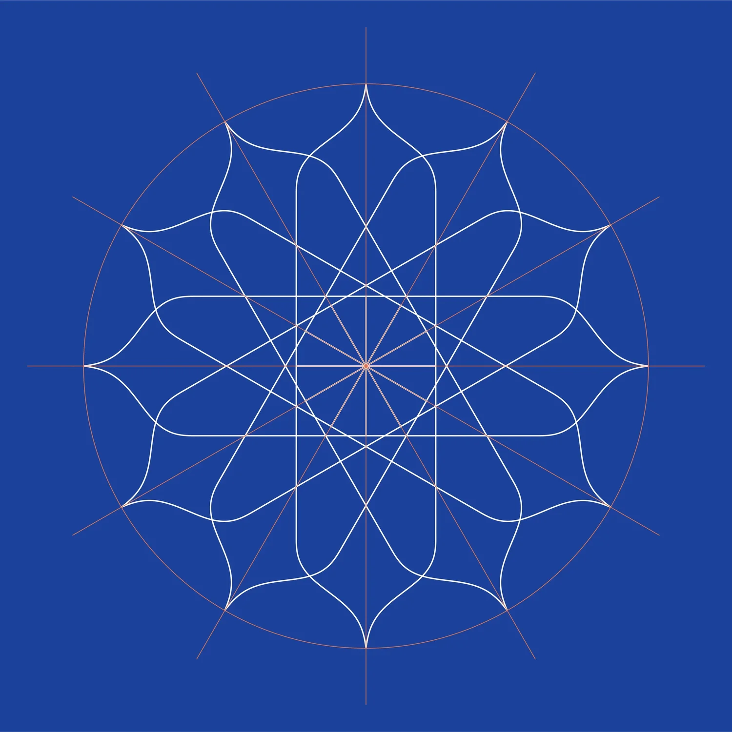
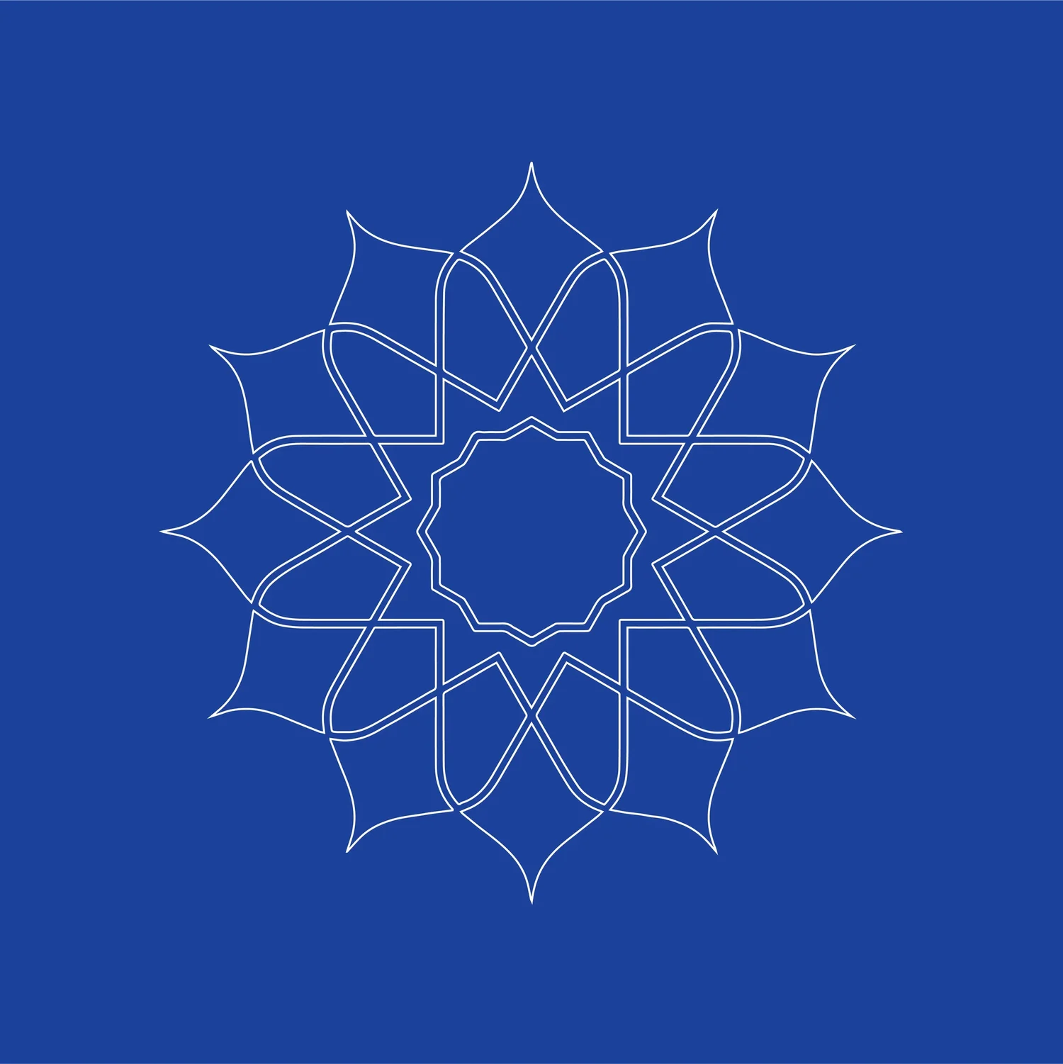
The geometric exploration then draws from the vocabulary of Moroccan and Islamic architecture: repetition, symmetry, the weaving of lines that interlock until they form a single motif. The zellige tiles of the medinas, the muqarnas of the palaces, the arabesques of the moucharabiehs — ornamental systems that share a single rule: beauty is born of constraint. Every line implies another. Every void is held by a presence. The logo, in the end, is neither a plant nor an architectural motif. It is what the two say together — the patience of a flower and the rigour of a calculation.
In use.
In progress – three geometric explorations
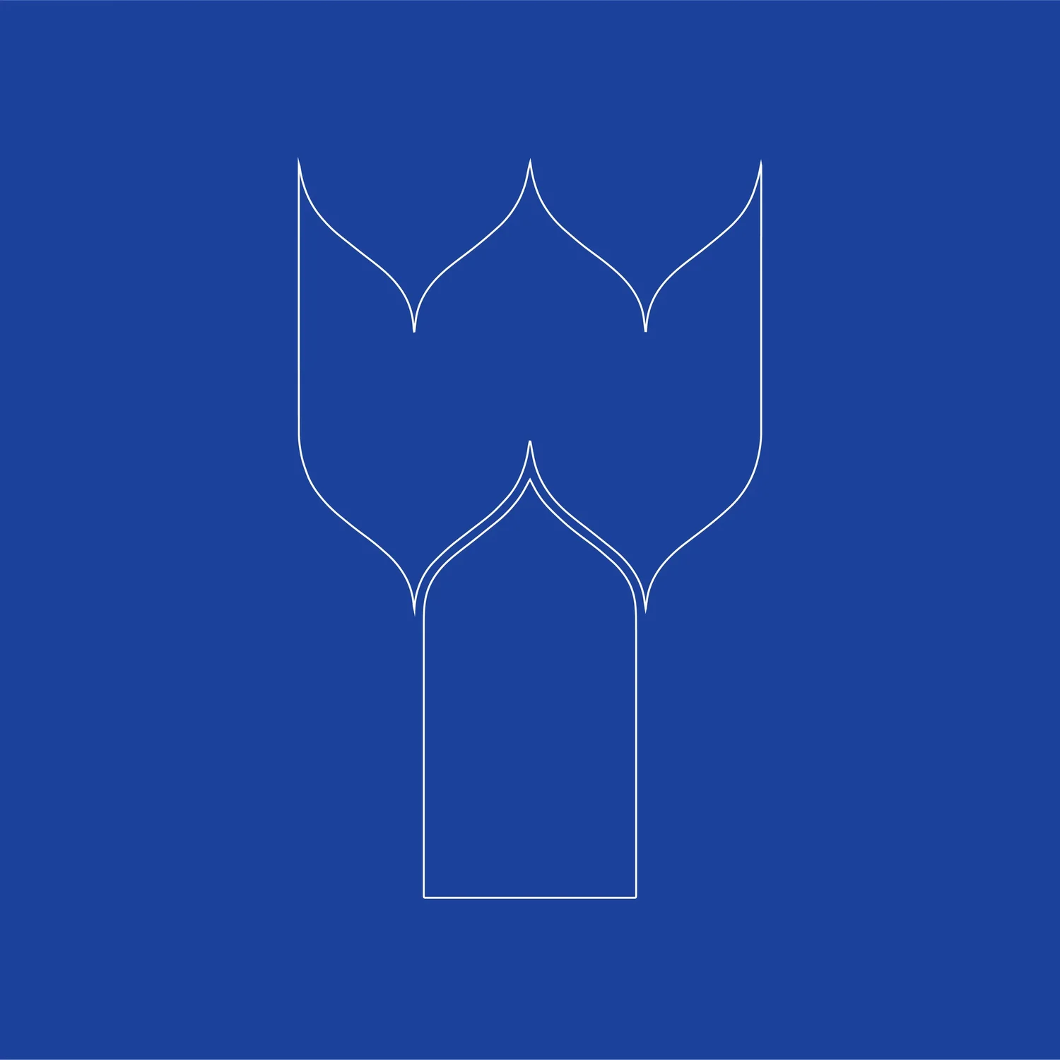
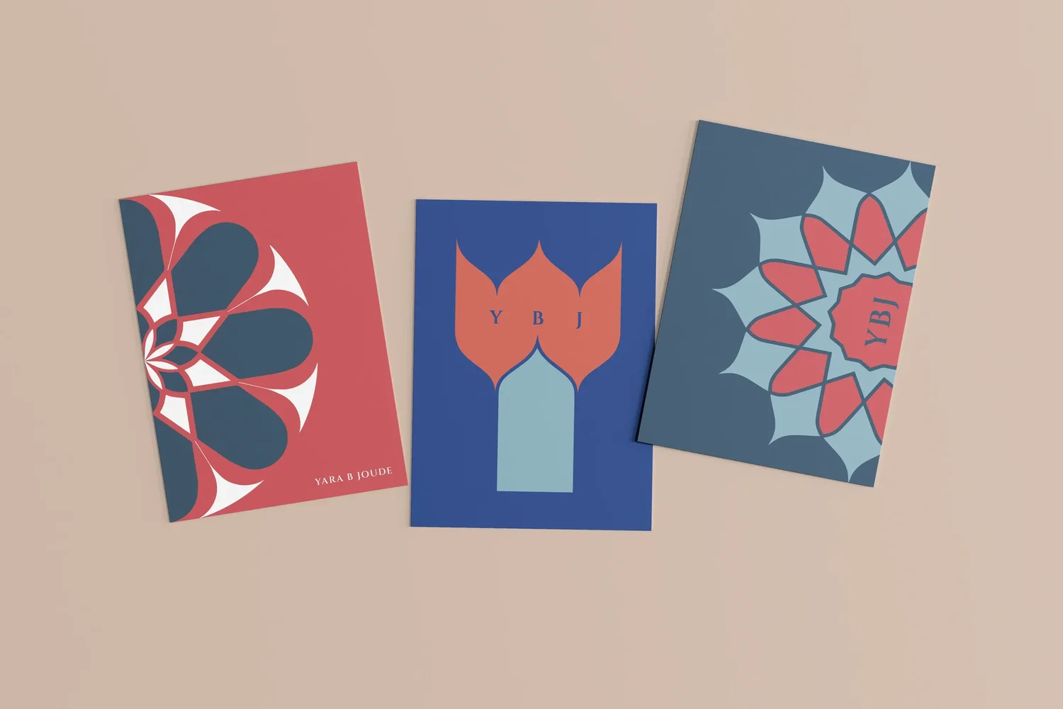

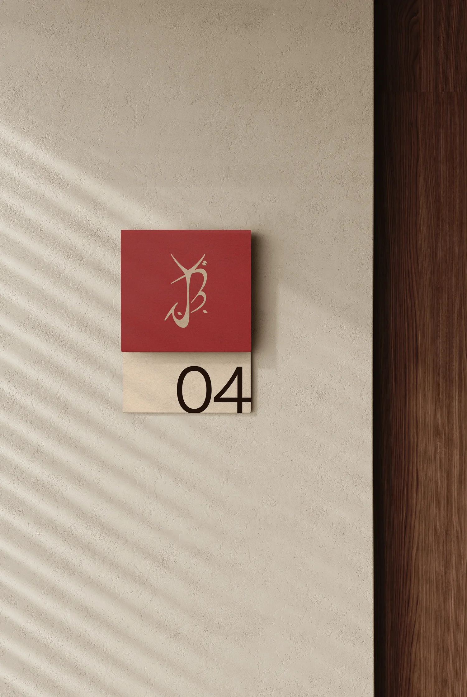
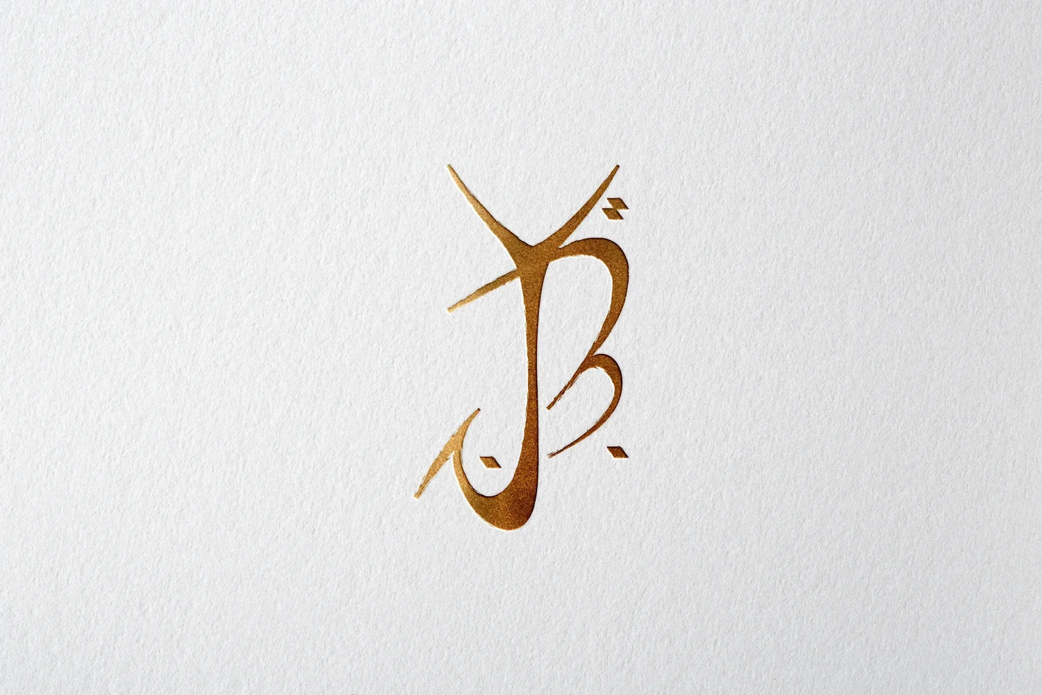
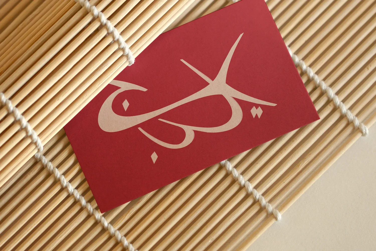
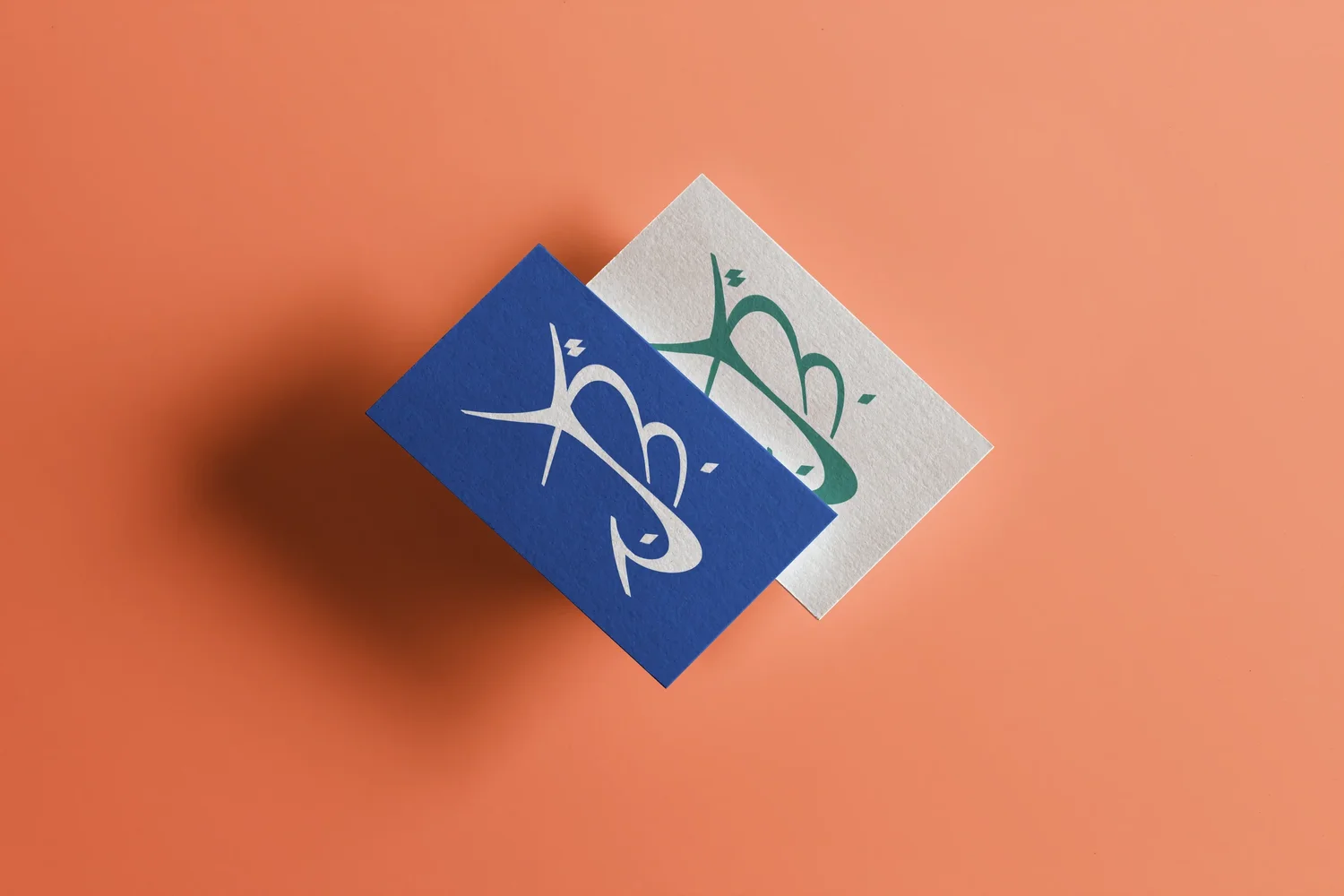
The final identity is a typographic exercise. The three initials — Y, B, J — compose into a single stroke, somewhere between a Western monogram and an Ottoman tughra, the calligraphic signature in which several letters interlock until they form a single shape. The gesture does not imitate Arabic script: it borrows its grammar. The contrast of thick and thin strokes, the continuous trace of a reed pen, the diamond-shaped diacritics — all elements drawn from the Maghrebi calligraphic tradition, without a single Arabic letter appearing on the page.
Three Latin letters, then, drawn in the language of another script. The Y carries the opening gesture, the B nests at the centre, the J extends its descender like the tail of a ج or a ر. The result is neither a word nor a conventional acronym — it is a visual signature, a single stroke that condenses the identity of Yara B Joude into the discipline of a calligraphic gesture. What the flower could not be, the line became: a meeting of two graphic worlds, with neither effacing the other.
The desert.
The flower.
The identity.